Babylon 5 2×01 Effects Update Supplemental- Their Horses Were On Fire

With the Audio Guide to Babylon 5 getting into the third season of the show, and RedTed’s Babylon 5 model coming along nicely, I’ve been feeling more excitement about my old B5 effects project, which has been safely tucked in the back of my mind for the past few years. I think I’d like to take care of some more of the prerequisites before I jump back into making shots, not in the least because I’d also like to finish my current Star Trek project without introducing one of my trademark delays. I also think it’d be prudent for me to act as if this isn’t going to be a one-episode wonder, and take my time in laying the groundwork for continuing this project indefinitely.

Luckily, in my last post, I promised an investigation into the three depictions of the Battle of the Line in Babylon 5. I’d like to make all the depictions of the battle as consistent as possible, so I wanted to catalogue what happened, and which redone shots corresponded with which earlier shots. Let’s start with a chart of my findings, and then there will be some further discussion. I’ve listed the shots in chronological order.

Continue reading

Random Trek #86- “Time’s Arrow, Parts 1 & 2”

Random Trek 86: “Time’s Arrow Part 1 and 2” (TNG) with David Gian-Cursio

Random Trek 86: “Time’s Arrow Part 1 and 2” (TNG) with David Gian-Cursio

Back around Thanksgiving of 2015, I was listening to an episode of the podcast Random Trek, when the host, Scott McNulty, mentioned being a fan of the Ships of the Line art calendars. I tweeted him, mentioning that I’d be in the 2016 edition, and he invited me to appear on the show to coincide with my picture coming up.

The premise of Random Trek, simply put, is that Scott discusses a random episode of Star Trek with a non-random guest. As luck would have it, the random number generator gave us the episode “Time’s Arrow,” the two-part season-finalé/première of The Next Generation’s fifth and sixth seasons. As is Random Trek’s custom, this meant we recorded a double-length episode discussing both parts. And it’s a good thing, too, because we blew past a single episode’s runtime just discussing myself, the calendar, and nerding out on Star Trek in general. And I probably could’ve kept going, but I knew people came to hear about Data meeting Mark Twain, and not my many, many opinions on Star Trek.

To Random Trek listeners who are visiting for the first time, welcome! In the spirt of restraint and being a well-mannered guest, I didn’t pimp myself out too much on the air, but you’re on my website, now! Aside from the Ships of the Line 2016 calendar, some of my other notable works include my on-hiatus project to remake the visual effects of an episode of Babylon 5 (I’ll get back to it eventually), cutscenes for the fan-made Battlestar Galactica flight sim Diaspora, and contributions to various projects with Ninjaneer Studios, including a Ming treasure-ship for the opera The Red Silk Thread and a ruined city for the exhibit Corrosion: The Silent Menace at the Orlando Science Center (featuring TNG alum LeVar Burton).

If you’d like to keep up with me, my Twitter handle is @davidcgc, and I can often be found hanging around Foundation3D, the A.V. Club, and the TrekBBS.

In the spirit of providing added value, here are some notes and links related to things I mentioned on the show.

SotL_Feb_2016_Comparing_Notes_Amazon_Preview

“Comparing Notes,” as it appears in the calendar. Image courtesy of Amazon.com

Continue reading

Archer-class Starship

Comparison of my model with Masao Okazaki’s original schematic drawing

Download Lightwave 2015 Version

Download FBX/OBJ Version

The Archer-class starship is a small TOS-era scout designed by Masao Okazaki for the Star Trek: Vanguard novels created by David Mack, Dayton Ward & Kevin Dilmore, and Marco Palmieri. I began the model some time ago, after getting the idea of doing an opening credits sequence animation for the then-recently-announced Star Trek: Seekers spin-off series.

Continue reading

Warp Point Nine

After reading “Return to Tomorrow,” including a description of how the jump-to-warp effect was achieved in TMP (multiple long exposures, with the main trail coming from shooting a long exposure with blue fill lighting), I decided that I’d have to give it a shot myself, sooner or later.

Not long after, I tracked down an old render of the Enterprise-E I quite liked, “Apocalyptic Amenity,” since I kept being reminded it of it by the title of the Trek novel “Armageddon’s Arrow.” I even had it as my phone wallpaper for a while, and then felt awkward that I didn’t have any work of my own I could use on a phone, since I never do anything in portrait. I decided that I’d have to give it a shot myself, sooner or later.

So I set up a scene a week or so back. I looked up some iOS wallpaper templates (because it’s not just the screen, there’s also a margin for the parallax effect), and decided to render out a large square version that I could crop down for an iPhone, or leave as-is for an iPad, or crop to who knows what. I aligned it to leave a gap for the date and time, and so the lines of perspective would make a nice dynamic composition. Unfortunately, I didn’t know the Big iPad would become a real thing today, so it’s not quite large enough for that.

I did some test renders, and found I couldn’t get a long-exposure effect in a single render (at least, not by setting the motion blur distance to greater that 100%, attempting to have it encompass multiple frames of action). What I ended up doing was setting up an animation, setting the motion blur distance to 100% so each frame would touch to the next, and then rendering an image sequence for the length of the streak I wanted. After that, I brought them all into Photoshop as layers in a single document with additive blending, creating nice, smooth light trails.

The way I did the rainbow streaks was excessively painstaking. I took out the final warp-jump in the film, and set it as my background in Lightwave Layout. I modeled a single streak, and then painstaking rotated every one into place to match the pattern of the original after lining up my camera to the original shot. I don’t know if the streaks were in the same pattern for the other three warp shots in the film, and I don’t care. I’ll be happier not checking.

TMP Warp iPad

TMP Warp iPhone 5

Refit-Enterprise by Dennis Bailey

Enterprise-Refit Interiors

Last year, around the time the 5K iMac and 2016 Ships of the Line calendar contest were announced, I got the idea of making window boxes for Dennis Bailey’s refit-Enterprise model so as to show more detail in the high-resolution images of the future. This has been my favorite science fiction design for as long as I can remember, so simple textured boxes were right out. I wanted to have furniture, even crew people visible through the windows. It took a while but, the results were worth it.

The layout of the rooms is based more-or-less on the Strategic Designs blueprint set, with some details from Mr. Scott’s Guide to the Enterprise and my own interpretations.

The model includes three swappable objects, based on locations that changed between the original Enterprise and the A. The officer’s lounge under the bridge can be replaced with a dining room, the large shuttlebay from TMP can be swapped for the enclosed version from TFF, and the swirling, gaseous warp core from the early movies can exchanged for the pulsing TNG model. The idea is that I could easily mix-and-match to represent other Constitution-class ships of varying configurations. I’m a big fan of the idea that sister-ships shouldn’t be perfectly identical except for the name painted on the front.

The whole configuration also comes in two versions, one in smooth earth-tones as the original Enterprise appeared in the first three movies, and one with more greeblies and silver and blue-gray coloring as the Enterprise-A appeared in The Undiscovered Country.

The crew people are very low-detail, little more than stick figures, but come in male and female, and have various skin tones and hair colors. I also set them up so it was simple to change the style of their uniforms, from the movie-era all the way to the various TNG-era uniforms.

The only drawback is that the lighting for the windows is a little dim compared to the official model, but I’ve been rendering in passes for years anyway, so it isn’t any trouble to brighten up the windows after the fact.

I included some small shots from inside the rooms but, to be clear, this is an exterior-only model. It’s no secret that interiors and exteriors for buildings and vehicles in film rarely match up perfectly, and these are no exception, with compromises made for the Recreation Deck, the Cargo Bay, and the height of all the rooms along the saucer’s edge, especially. Anyone building a model of the interiors of the movie-era Enterprise would have to ignore the outer shape of the ship to get those to look correct. The shuttlebay observation galleries being a half-deck below the window line on the exterior ship could be argued to be a feature of the “real” ship, but I’m not sure I like it.

After I finished the interior, I decided to gussy up the texturing on the main model, as well. I’ve been fiddling with the textures and lighting setup since I first downloaded it, but this time I set out to match the reflective, pearlescent paint job the studio model had for the first Star Trek movie. It ended up being surprisingly straightforward to get multi-colored highlights out of the model’s original textures, and adding reflectivity to the surfaces also required only a little trial-and-error to nail down.

I’ve rendered off shots from three angles so you compare Dennis’s original model to all the stuff I’ve done to it.

My version is on the left, the original on the right.


Ent_Front_Mod_Blue

And here are some full-sized versions of my revamp for you.

You can see more work-in-progress images and read more details about the creation of model in this thread at Foundation3D. The model itself, along with an FBX conversion, and just the crew figures, is also available for download there. You’ll have to modify Dennis’s model to use them, which is why they’re in the “unfinished” section of F3D, but the Read Me explains what you need to look for.

You can also download them here:

Interiors (LWO)

Interiors (FBX)

Crew (LWO & FBX)

Comparing Notes

“Comparing Notes” was one of three favorite Trek images I submitted for consideration in the 2016 Ships of the Line Calendar contest (The others were “Charting the Crucible” and “Quiet Night at the Office,” if you’re curious). This one was a winner! I’d hoped to have a chance to gussy up the render for the calendar, but I ended up only having time to make a couple small tweaks when I re-rendered it at print resolution. I adjusted the lighting so the blue and yellow banding in the shadows that I mention was less apparent, corrected a minor lighting problem on the Enterprise’s neck that made a harsh shadow, and added some very subtle window boxes to the Endeavour. I didn’t finish the window boxes for the Enterprisethough I have been working on them in the meantime. I also opened up the frame vertically since the aspect ratio of the calendar is taller than I usually make my pictures.

Original Post:

Comparing Notes

Having some time to return to Lightwave and a truly spiffy model of the TMP drydock, I decided to address an image bunny which had been itching me for a while. Namely, I’d wanted to do a take on this Andrew Probert painting with the Enterprise reflected pre- and post-refit. I ultimately remembered a photo from 1912 of the Titanic and her sister ship Olympic side-by-side at the repair yard and decided to do something similar.

In this case, the newly-upgraded Enterprise has returned to Earth so the engineers of the U.S.S. Endeavour can get some practical experience with the new designs as they begin to refit their own ship.

I colored the main light as if the sun had just set at that moment. It gives the picture a bit of a sepia tone. It also explains why the image is so grainy, because the photo had to be taken at a very high ISO since there was no more direct sunlight. I pulled the colors from this photo. In retrospect, I botched the lighting a little, as you can see banded shadows because I used two lights, one blue to represent the upper sky, and one red to represent the sky at the horizon. I am, however, very happy with the coherence (for want of a better term) of the image. A lot of times, the different eras of Star Trek can end up looking like totally different universes, and I feel like I avoided that in this one. There doesn’t seem anything at all odd about the original series and movie era sitting side-by-side.

I’m actually thinking I might be able to get a little more milage out of this picture. I may try out some alternate lighting setups.

Comparing_Notes_Midnight

Observational Humor

Recently, my friends Brandon and Dave (as well as their co-host Clay, who I haven’t met but seems like a fine person) began a podcast, Observational, where they discuss documentaries “that are fun, crazy, or mind blowing.” During the development process late last year, they asked me if I would create the album art for the show.

First, we brainstormed a few concepts which I sketched out on pen-and-paper (you can see how I sketch in earlier posts, so I don’t feel like I need to subject you to that again). I then created three mock-ups in Photoshop, using the show’s working title, “Cinéma Vérité,” so we could get a sense of how the real thing might look.


Projector 1

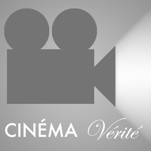
One used a simple film-camera icon with a light-beam coming out of it (which I realized while drawing it really made it more of a projector icon).


Shadow 1

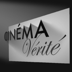
Another, my personal favorite, had a movie screen, with the word “Cinéma” floating in front of it, casting a shadow which formed the word “Vérité.” I appreciated how the concept had levels, pointing out the illusion of cinema in the “This is Not a Pipe” sense, as well as more specifically how there is an inherent tension in the form of the documentary by using dramaturgical and storytelling devices (to different extent than written reporting) while presenting what may be taken to be an objective, factual account. The dichotomy between communicating truth through a medium consisting wholly of illusion is what I’m getting at, here.

If this concept went ahead, it was my intention to create it in 3D, so the lines of perspective and depth effects would match up more effectively than they do in this sketch.


I had another concept that drew on this idea, where a realistic silhouette of a bird in flight would be a shadow cast by a hand-puppet, but I couldn’t think of a way to arrange this in a square still frame that could be seen in forms as small as a postage stamp. It’d be easy enough to communicate the concept in an animated form, so I guess I’ve come up with my production logo, assuming no one else uses the idea in the meantime. Or has used it already, for that matter.


Flim Strip 1

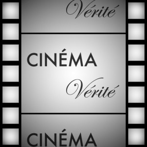
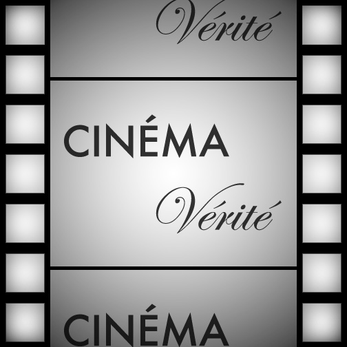
The other alternative I offered was the title of the podcast on a film-strip background.


Just before presenting these, I was told the title of the podcast had been changed to “Observational,” so my shadow-casting idea was out, as it required two words. Of the remaining choices, the film-strip concept was the winner, and we went through the normal process of revisions.


Observational_Evolution

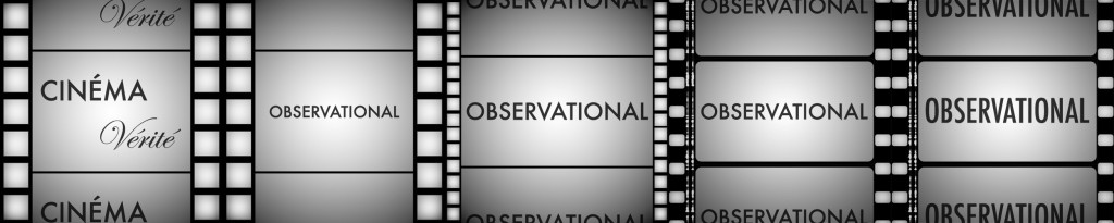
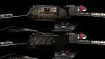
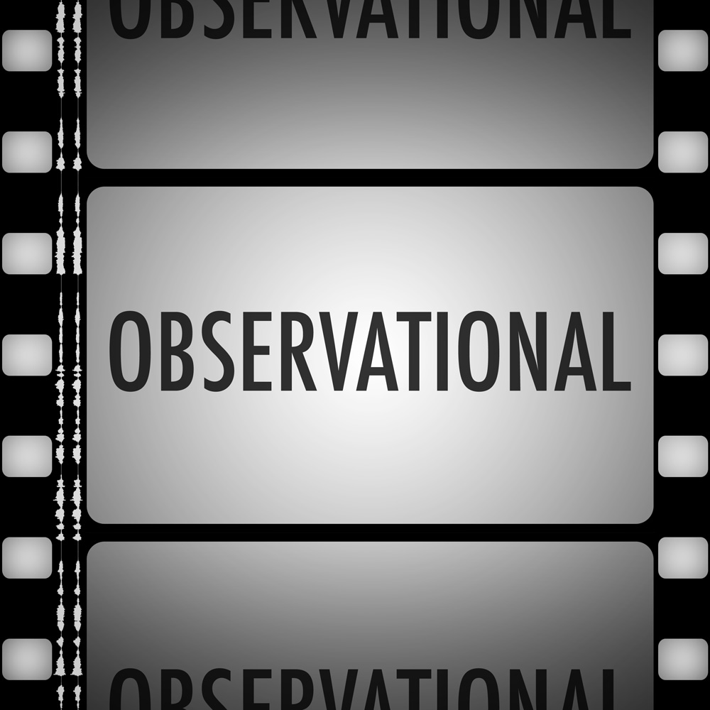
As you can see, after the rough size of the various elements was settled on, I moved to a more realistic design for the film strip for the production version, with properly-spaced sprockets and even a stereo soundtrack.


One thing I hadn’t anticipated was that the icon might be shown tiled on top of itself in a podcast client. When I downloaded the multiple consecutive episodes in Overcast, I realized that was a greater oversight than I had thought.

Overcast Old Icon

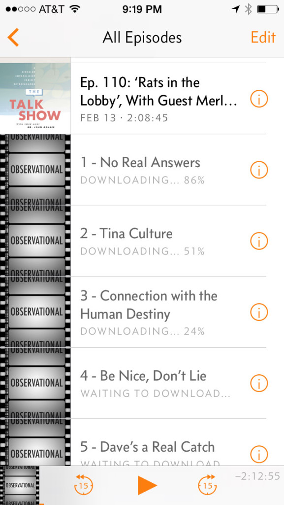
I went back to my laughably-named “Final” Photoshop file (one day, I’ll learn to stop using that word) and began adjusting it with tiling in mind. I made the sprockets along the sides take up an even amount of the frame, and adjusted the “film cells” in the center so the preceding and succeeding frames would be cut off in their center. I also added an additional gradient layer to the top and bottom frames to darken them evenly along the edge.

Overcast New Icon


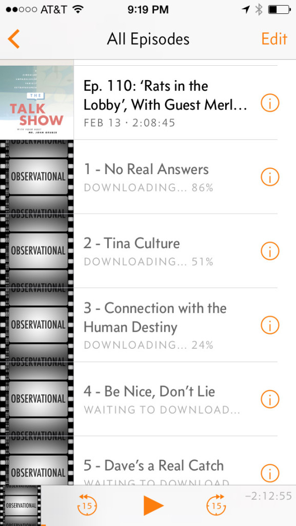
And here, at long last, is the fina— that is to say, most current version.

Observational_Album_Art_Adjusted_2015-02-15

You can download Observational via iTunes, or wherever fine podcasts are available.

Something you want to add to this briefing, Captain?

Diaspora is a space combat simulation game set in the universe of the remade Battlestar Galactica, and based on the Freespace 2 engine. It’s super-fun and polished, and if you ever wanted to fly a Viper, you should probably download it now. A while ago, the call came out once again for volunteers, specifically mentioning visual effects animators. I leapt at the chance.

When you ask to join the Diaspora team, there’s an audition process where you’re given a minor assignment in whatever your area is. The original concept for mine was deceptively simple: In several episodes, the Galatica’s “war room” was seen, which had as its centerpiece a large light-table where the crew pushed around little models with sticks to plan attacks, or keep track of battles that were in-progress. The concept was to have a 3D-rendered version of the table and these models, and to show them being pushed around in a cutscene, to replace one of the in-engine briefings for “Shattered Armistice,” the first episodic release of Diaspora.

Warroom
Warroom_overview
Models_2012_10_15_a
Models_2012_10_20_a

After some modeling and some R&D figuring out what the best conceit was for how to present it, we settled on the idea that a war room strategy session with the CAG, CO, XO, and other important initials which was recorded by a ceiling-mounted camera, and was being played back for the pilots on the briefing room overhead projector.

Table

After animating the models being pushed around in time to the existing voiceover, I saw there were a lot of holds and dead air, and there were some concepts I was worried weren’t being communicated, such as the location of the missile batteries to be targeted on the enemy ships, so I experimented with cutting in some “gun-cam photos” of the Cylon basestars, and an engineering status screen. These were a hit with the team, so I continued in that vein, using the tabletop models in a supporting role as one visual aid among many.

M2 Gun Cam Vid 2 Missiles

Once I had a completed cut of the briefing, I was officially inducted, which consisted mostly of me getting a little icon on the Diaspora forums implying I know what I’m talking about. Lacking anything else to do, and realizing that it’d be kind of weird to have just one cutscene briefing, I started replacing all the single-player mission briefings for “Shattered Armistice.” Since there was only one mission with a degree of planning or strategic complexity that justifies the use of the war room, I created DRADIS readouts, starcharts, comm-screens, countdown clocks, and whatever else I could think of that the CAG might slap together into a futuristic PowerPoint show for her briefings. I even redid the engineering readout for the first briefing I did, after I’d built up a library of BSG-style computer graphics. And let me give a shoutout to Matt Haley, who recreated the DRADIS screen in Adobe Illustrator and graciously allowed me to use it and build on it in these cutscenes.

FTL System Report Screen Animatable
System Plot M4
Basestar Orbit

The most ambitious section was easily the recording of a pilot being shot down for the third mission’s briefing.

I animated a BSG-style space-battle, shot from a Viper gun-camera, with no cuts. The most challenging part was working out the timing and animation of the camera, so I could show everything I needed to show, without a lot of dead air, while still feeling like something the player would recognize from the show and, more importantly, from their experiences with the game, where they would’ve been playing the mission this recording was depicting moments earlier.

Battle 1
Battle 2
Battle 3
Battle 4

As a bonus, I created desktop-sized renders of all the tabletop models I created for this project, including several that weren’t used. At least, not in this release.

A version of this post appeared on the Diaspora Developer Blog.