Random Trek #86- “Time’s Arrow, Parts 1 & 2”

Random Trek 86: “Time’s Arrow Part 1 and 2” (TNG) with David Gian-Cursio

Random Trek 86: “Time’s Arrow Part 1 and 2” (TNG) with David Gian-Cursio

Back around Thanksgiving of 2015, I was listening to an episode of the podcast Random Trek, when the host, Scott McNulty, mentioned being a fan of the Ships of the Line art calendars. I tweeted him, mentioning that I’d be in the 2016 edition, and he invited me to appear on the show to coincide with my picture coming up.

The premise of Random Trek, simply put, is that Scott discusses a random episode of Star Trek with a non-random guest. As luck would have it, the random number generator gave us the episode “Time’s Arrow,” the two-part season-finalé/première of The Next Generation’s fifth and sixth seasons. As is Random Trek’s custom, this meant we recorded a double-length episode discussing both parts. And it’s a good thing, too, because we blew past a single episode’s runtime just discussing myself, the calendar, and nerding out on Star Trek in general. And I probably could’ve kept going, but I knew people came to hear about Data meeting Mark Twain, and not my many, many opinions on Star Trek.

To Random Trek listeners who are visiting for the first time, welcome! In the spirt of restraint and being a well-mannered guest, I didn’t pimp myself out too much on the air, but you’re on my website, now! Aside from the Ships of the Line 2016 calendar, some of my other notable works include my on-hiatus project to remake the visual effects of an episode of Babylon 5 (I’ll get back to it eventually), cutscenes for the fan-made Battlestar Galactica flight sim Diaspora, and contributions to various projects with Ninjaneer Studios, including a Ming treasure-ship for the opera The Red Silk Thread and a ruined city for the exhibit Corrosion: The Silent Menace at the Orlando Science Center (featuring TNG alum LeVar Burton).

If you’d like to keep up with me, my Twitter handle is @davidcgc, and I can often be found hanging around Foundation3D, the A.V. Club, and the TrekBBS.

In the spirit of providing added value, here are some notes and links related to things I mentioned on the show.

SotL_Feb_2016_Comparing_Notes_Amazon_Preview

“Comparing Notes,” as it appears in the calendar. Image courtesy of Amazon.com

Continue reading

Archer-class Starship

Comparison of my model with Masao Okazaki’s original schematic drawing

Download Lightwave 2015 Version

Download FBX/OBJ Version

The Archer-class starship is a small TOS-era scout designed by Masao Okazaki for the Star Trek: Vanguard novels created by David Mack, Dayton Ward & Kevin Dilmore, and Marco Palmieri. I began the model some time ago, after getting the idea of doing an opening credits sequence animation for the then-recently-announced Star Trek: Seekers spin-off series.

Continue reading

Warp Point Nine

After reading “Return to Tomorrow,” including a description of how the jump-to-warp effect was achieved in TMP (multiple long exposures, with the main trail coming from shooting a long exposure with blue fill lighting), I decided that I’d have to give it a shot myself, sooner or later.

Not long after, I tracked down an old render of the Enterprise-E I quite liked, “Apocalyptic Amenity,” since I kept being reminded it of it by the title of the Trek novel “Armageddon’s Arrow.” I even had it as my phone wallpaper for a while, and then felt awkward that I didn’t have any work of my own I could use on a phone, since I never do anything in portrait. I decided that I’d have to give it a shot myself, sooner or later.

So I set up a scene a week or so back. I looked up some iOS wallpaper templates (because it’s not just the screen, there’s also a margin for the parallax effect), and decided to render out a large square version that I could crop down for an iPhone, or leave as-is for an iPad, or crop to who knows what. I aligned it to leave a gap for the date and time, and so the lines of perspective would make a nice dynamic composition. Unfortunately, I didn’t know the Big iPad would become a real thing today, so it’s not quite large enough for that.

I did some test renders, and found I couldn’t get a long-exposure effect in a single render (at least, not by setting the motion blur distance to greater that 100%, attempting to have it encompass multiple frames of action). What I ended up doing was setting up an animation, setting the motion blur distance to 100% so each frame would touch to the next, and then rendering an image sequence for the length of the streak I wanted. After that, I brought them all into Photoshop as layers in a single document with additive blending, creating nice, smooth light trails.

The way I did the rainbow streaks was excessively painstaking. I took out the final warp-jump in the film, and set it as my background in Lightwave Layout. I modeled a single streak, and then painstaking rotated every one into place to match the pattern of the original after lining up my camera to the original shot. I don’t know if the streaks were in the same pattern for the other three warp shots in the film, and I don’t care. I’ll be happier not checking.

TMP Warp iPad

TMP Warp iPhone 5

Refit-Enterprise by Dennis Bailey

Enterprise-Refit Interiors

Last year, around the time the 5K iMac and 2016 Ships of the Line calendar contest were announced, I got the idea of making window boxes for Dennis Bailey’s refit-Enterprise model so as to show more detail in the high-resolution images of the future. This has been my favorite science fiction design for as long as I can remember, so simple textured boxes were right out. I wanted to have furniture, even crew people visible through the windows. It took a while but, the results were worth it.

The layout of the rooms is based more-or-less on the Strategic Designs blueprint set, with some details from Mr. Scott’s Guide to the Enterprise and my own interpretations.

The model includes three swappable objects, based on locations that changed between the original Enterprise and the A. The officer’s lounge under the bridge can be replaced with a dining room, the large shuttlebay from TMP can be swapped for the enclosed version from TFF, and the swirling, gaseous warp core from the early movies can exchanged for the pulsing TNG model. The idea is that I could easily mix-and-match to represent other Constitution-class ships of varying configurations. I’m a big fan of the idea that sister-ships shouldn’t be perfectly identical except for the name painted on the front.

The whole configuration also comes in two versions, one in smooth earth-tones as the original Enterprise appeared in the first three movies, and one with more greeblies and silver and blue-gray coloring as the Enterprise-A appeared in The Undiscovered Country.

The crew people are very low-detail, little more than stick figures, but come in male and female, and have various skin tones and hair colors. I also set them up so it was simple to change the style of their uniforms, from the movie-era all the way to the various TNG-era uniforms.

The only drawback is that the lighting for the windows is a little dim compared to the official model, but I’ve been rendering in passes for years anyway, so it isn’t any trouble to brighten up the windows after the fact.

I included some small shots from inside the rooms but, to be clear, this is an exterior-only model. It’s no secret that interiors and exteriors for buildings and vehicles in film rarely match up perfectly, and these are no exception, with compromises made for the Recreation Deck, the Cargo Bay, and the height of all the rooms along the saucer’s edge, especially. Anyone building a model of the interiors of the movie-era Enterprise would have to ignore the outer shape of the ship to get those to look correct. The shuttlebay observation galleries being a half-deck below the window line on the exterior ship could be argued to be a feature of the “real” ship, but I’m not sure I like it.

After I finished the interior, I decided to gussy up the texturing on the main model, as well. I’ve been fiddling with the textures and lighting setup since I first downloaded it, but this time I set out to match the reflective, pearlescent paint job the studio model had for the first Star Trek movie. It ended up being surprisingly straightforward to get multi-colored highlights out of the model’s original textures, and adding reflectivity to the surfaces also required only a little trial-and-error to nail down.

I’ve rendered off shots from three angles so you compare Dennis’s original model to all the stuff I’ve done to it.

My version is on the left, the original on the right.


Ent_Front_Mod_Blue

And here are some full-sized versions of my revamp for you.

You can see more work-in-progress images and read more details about the creation of model in this thread at Foundation3D. The model itself, along with an FBX conversion, and just the crew figures, is also available for download there. You’ll have to modify Dennis’s model to use them, which is why they’re in the “unfinished” section of F3D, but the Read Me explains what you need to look for.

You can also download them here:

Interiors (LWO)

Interiors (FBX)

Crew (LWO & FBX)

Comparing Notes

“Comparing Notes” was one of three favorite Trek images I submitted for consideration in the 2016 Ships of the Line Calendar contest (The others were “Charting the Crucible” and “Quiet Night at the Office,” if you’re curious). This one was a winner! I’d hoped to have a chance to gussy up the render for the calendar, but I ended up only having time to make a couple small tweaks when I re-rendered it at print resolution. I adjusted the lighting so the blue and yellow banding in the shadows that I mention was less apparent, corrected a minor lighting problem on the Enterprise’s neck that made a harsh shadow, and added some very subtle window boxes to the Endeavour. I didn’t finish the window boxes for the Enterprisethough I have been working on them in the meantime. I also opened up the frame vertically since the aspect ratio of the calendar is taller than I usually make my pictures.

Original Post:

Comparing Notes

Having some time to return to Lightwave and a truly spiffy model of the TMP drydock, I decided to address an image bunny which had been itching me for a while. Namely, I’d wanted to do a take on this Andrew Probert painting with the Enterprise reflected pre- and post-refit. I ultimately remembered a photo from 1912 of the Titanic and her sister ship Olympic side-by-side at the repair yard and decided to do something similar.

In this case, the newly-upgraded Enterprise has returned to Earth so the engineers of the U.S.S. Endeavour can get some practical experience with the new designs as they begin to refit their own ship.

I colored the main light as if the sun had just set at that moment. It gives the picture a bit of a sepia tone. It also explains why the image is so grainy, because the photo had to be taken at a very high ISO since there was no more direct sunlight. I pulled the colors from this photo. In retrospect, I botched the lighting a little, as you can see banded shadows because I used two lights, one blue to represent the upper sky, and one red to represent the sky at the horizon. I am, however, very happy with the coherence (for want of a better term) of the image. A lot of times, the different eras of Star Trek can end up looking like totally different universes, and I feel like I avoided that in this one. There doesn’t seem anything at all odd about the original series and movie era sitting side-by-side.

I’m actually thinking I might be able to get a little more milage out of this picture. I may try out some alternate lighting setups.

Comparing_Notes_Midnight

Step From the Road to the Sea to the Sky

A quick animation using Foundation 3D’s favorite new spaceship. There wasn’t much excitement to this. A bit of noise added to the camera to give it some wobble (which YouTube insists on trying to “correct”), and the Jupiter map was recolored in the comp to be an alien planet. The cloud plate was a photo I shot with my phone and then enlarged with this on-line tool, though I still had to do some noise reduction in Photoshop.

The most interesting thing was a new idea I tried to do the heat haze coming from the engines, which I made using After Effects’ “Displacement Map” filter. I created a couple of blimp-shaped dummy objects in Lightwave which I placed inside and behind the engines of the ship. I colored the environment and the ship 50% grey for the render, and gave the gave the haze objects an animated black-and-white procedural noise texture. I had the transparency fade towards the rear and edges of the object with gradients.

Prom_Gray_Haze

The Displacement Map filter can actually drive horizontal and vertical seperately displacement based on separate color channels. I experimented with using colored noise when I rendered the still frames, but it would only make a real difference in an animation.

Prom_Color_Haze

Credits:
Prometheus: Russell Tawn
Planet: James Hastings-Trew
Moons: Fridger Schrempp and Björn Jónsson
Rings: Yuri A. Parovin

I also have a trio of 4k stills for your viewing pleasure.

Prometheus_Flyby_Stills_00000

Prometheus_Flyby_Stills_00001

Prometheus_Flyby_Stills_00002

Tech the Tech: The Battlestar Galactica’s Hangar Deck

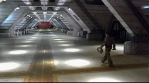
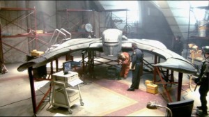
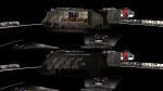
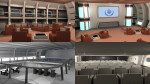
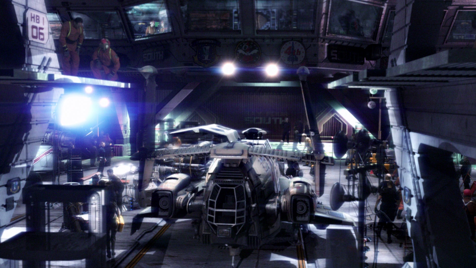
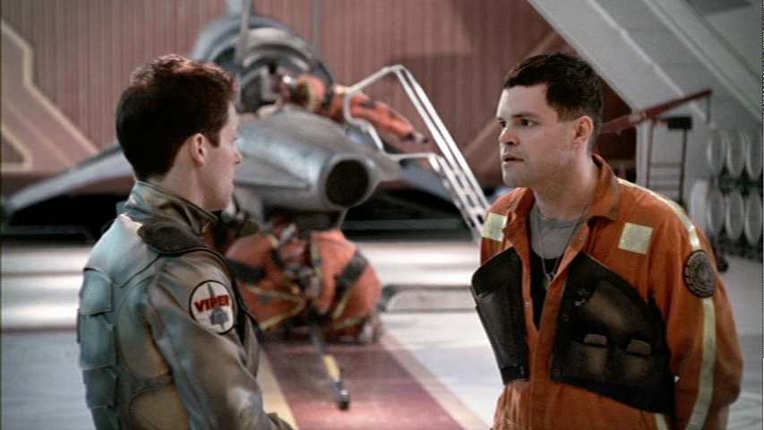
Buildings and vehicles in movies tend to have discrepancies between the exterior and interior, thanks to the realities of filming. It’s difficult to build an exterior mock-up to full scale, or construct an interior set to perfectly match the shape of a model. The Battlestar Galactica from the 2003 remake is a rare exception, and after some examination of it, I was surprised by how much effort went in to matching the hangar deck set with the design of the exterior of the ship. Years ago, I built a rough 3D model of the Galactica hangar, based on the model used for set extensions on the show, and I wanted to complete and expand it at some point. I began looking at the design of the ship in more detail in to start to work out a plan. A couple months ago, I found Lee Stringer’s Flickr, which included a bunch of photos taken of the hangar set, Viper Mark II prop, and the construction blueprints for both that were apparently taken during pre-production of the 2003 miniseries as reference for the VFX team to build their 3D versions. This was the motherlode, and I found that I’d have to restart my model from scratch once I compared it to the actual set drawings.

I don’t quite have the time to knuckle down and actually remake my hangar deck model yet based on this new information, but I can write up all the research and extrapolation I did rather than just keeping it in my brain and hoping I remember it all when I get around to it. I also intend to do posts like this (with increasing amounts of extrapolation) for the hangars of the Blood and Chrome version of Galactica, the Pegasus, the Valkyrie, and the Theseus from “Diaspora,” the fan-made BSG-themed game. I’m going to start with the physical set and CG set extensions, then the exterior model, and then synthesize the two together, including a few areas that logically should exist, but weren’t explicitly seen on the show because they can’t go rebuilding their biggest set every week to make the minority of fans watching with a pause button and a slide-rule happy.

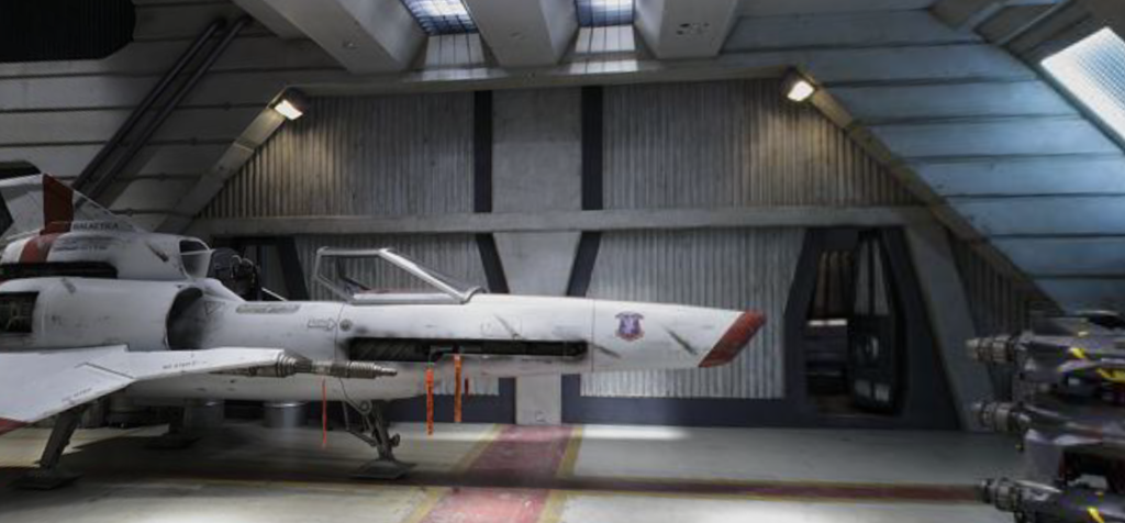
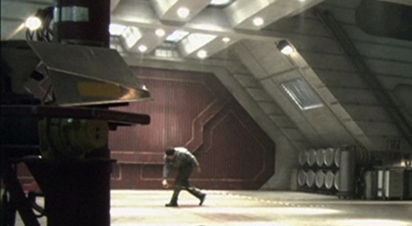
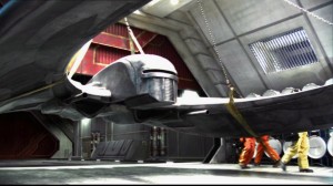
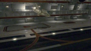
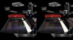
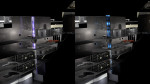
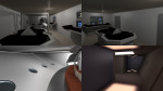
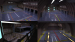
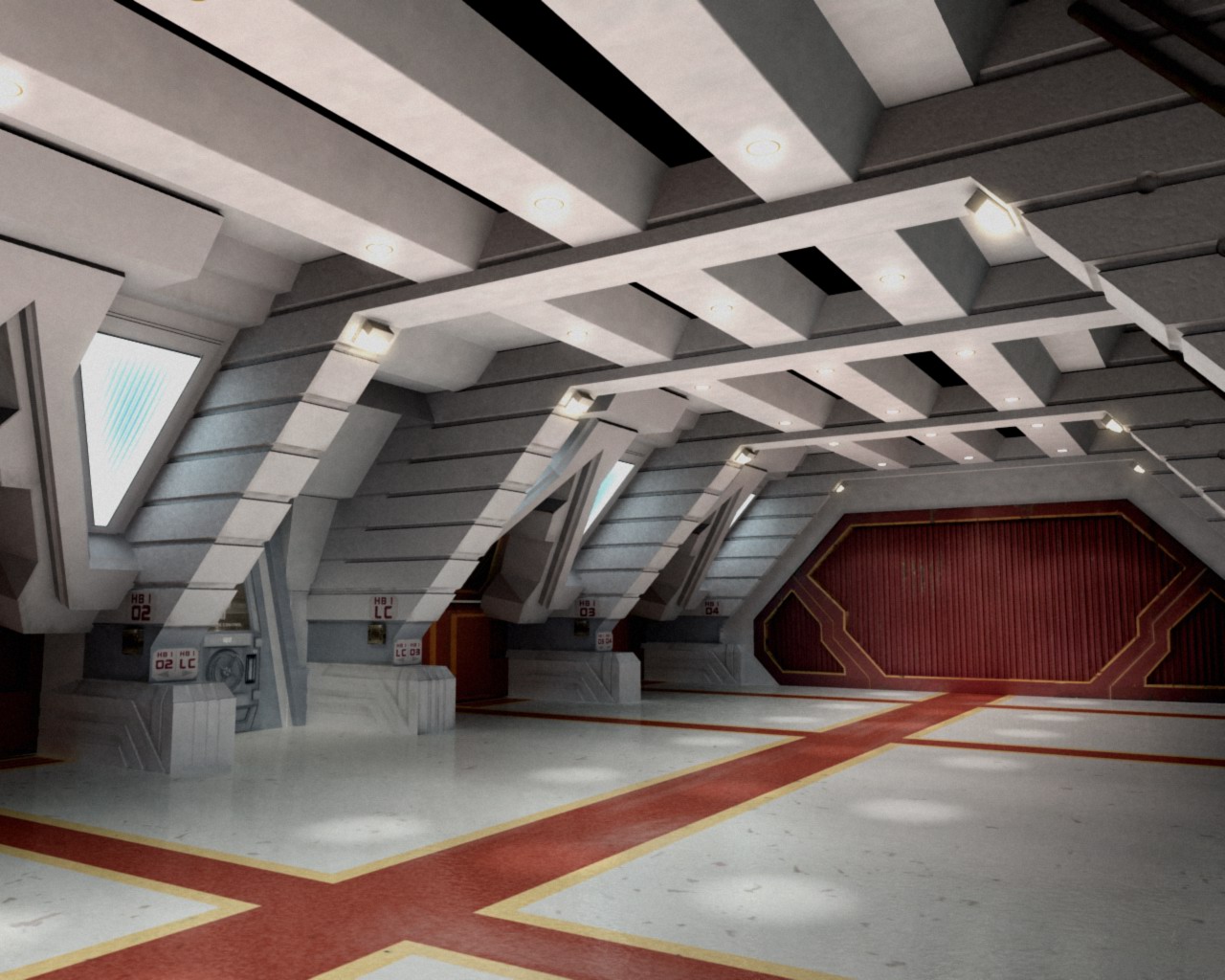
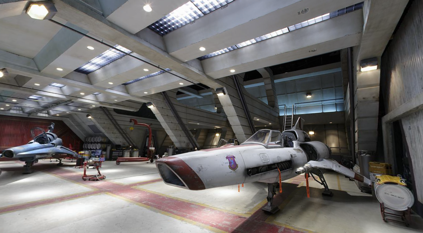
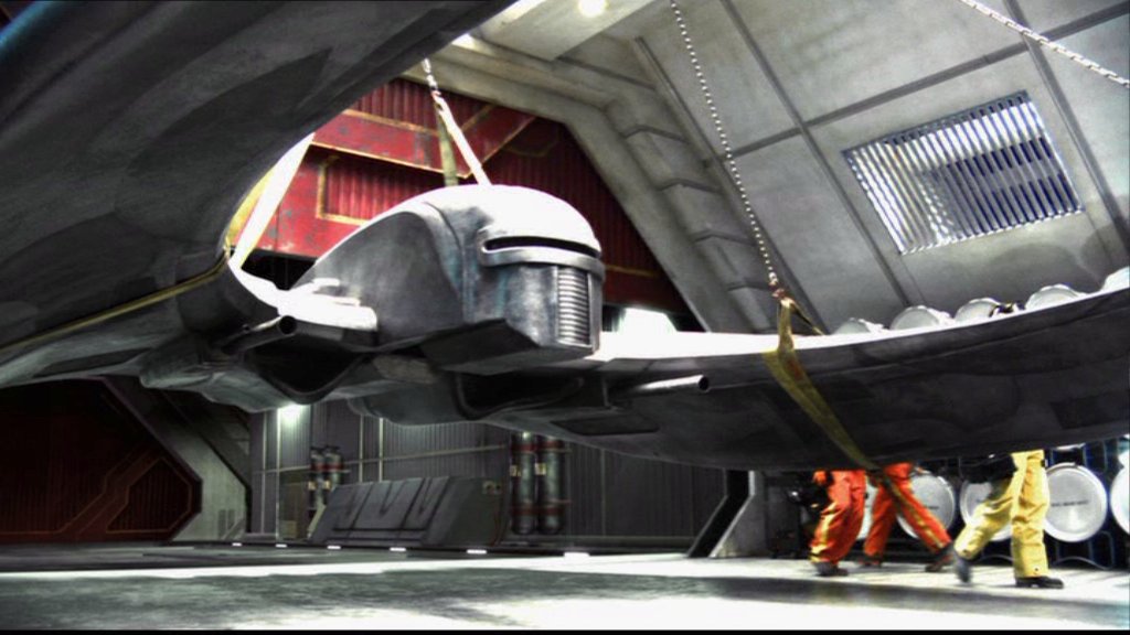
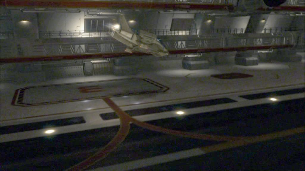
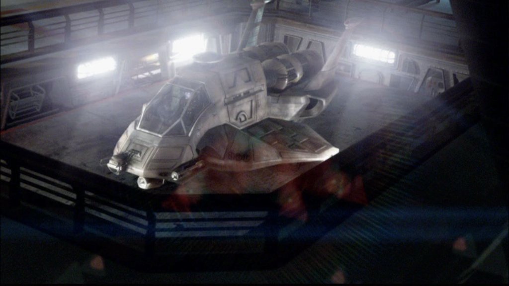
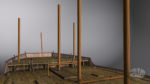
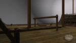
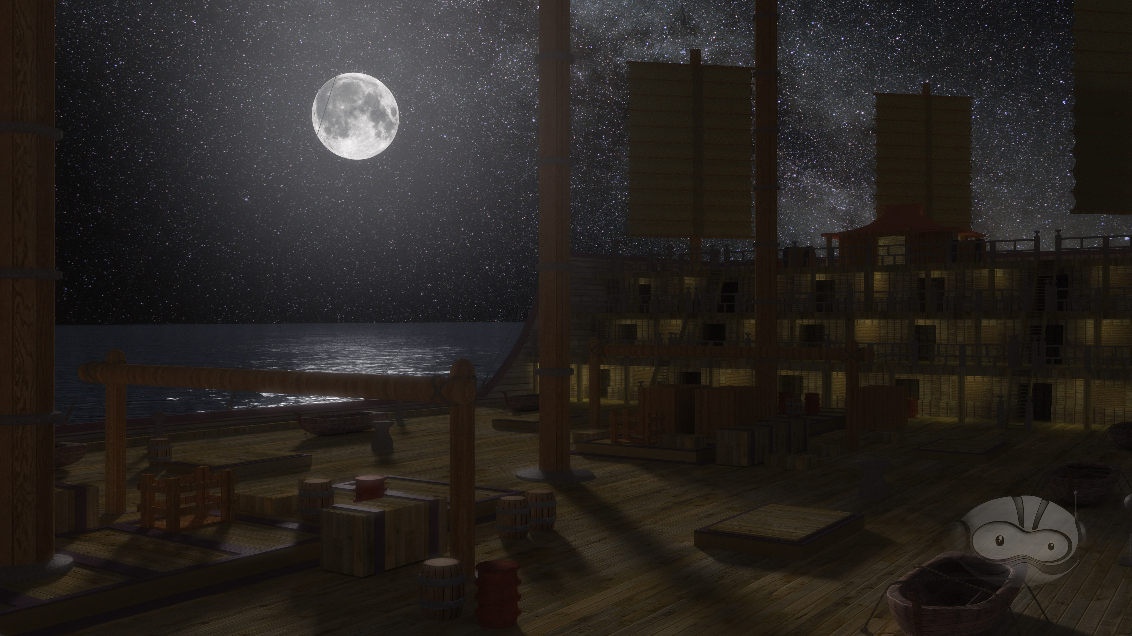
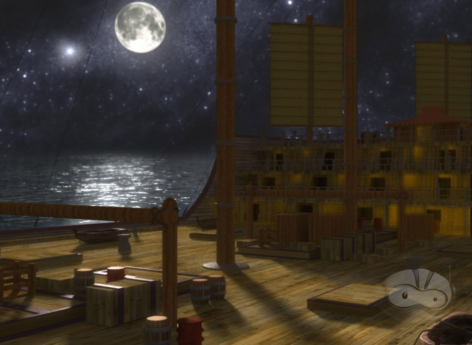
The set of the Galactica hangar deck is a standard segment, consisting of four launch tubes with a control room in between them on the outer side. On the inner side is a series of three semi-enclosed areas (two behind launch tubes and a wider one behind a launch tube and the control room) and a tool room. The tool room has a door leading out to the hangar deck, and another door on the inside, apparently connecting to a corridor.

kg_cg_ns_galactica-039

Screen Shot 2013-06-01 at 9.34.57 PM

Diagrams


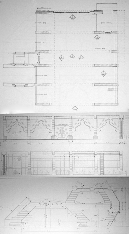
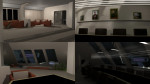
Each end of the hangar deck can be capped with a variety of endpieces or green-screen set extensions. These are:
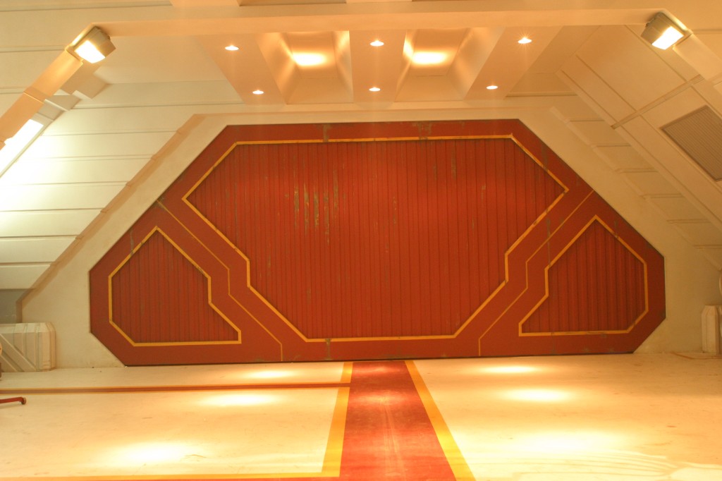
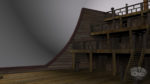
4735086402_21512dc2b3_o

Large door


Screen Shot 2013-06-02 at 9.51.41 PM

Bulkhead with two personnel hatches
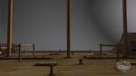
 

420_1822

More hangar


113_cap118

Aircraft Elevator


108_cap090

Bare Stage or Plastic Tarps and scaffolding

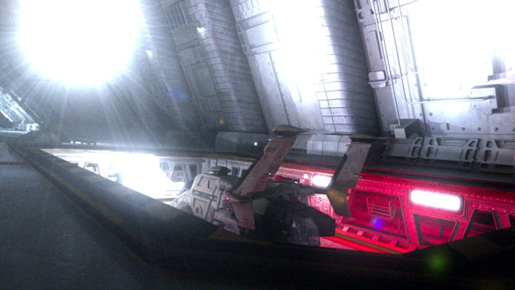
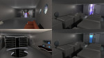
The Large Door was replaced with a different, more elaborate large door after the miniseries.

209_cap201

Interestingly, the miniseries door continued to appear as a CG element in set extensions for the rest of run of the show, even appearing once alongside the new physical door.

308_cap045

Both versions of the large door appear to be made of three interlocking segments, but they always move as one solid piece when they are shown retracting into the ceiling. There is one exception. In Blood and Chrome, the miniseries-style door was used for the Galactica and the Osiris hangar decks. While Galactica continues the tradition of showing the door as a single solid piece, when Adama’s Raptor launches from the Osiris, you can just barely see the top piece of the hangar door open first, followed by the lower corner pieces retracting to the sides.

Battlestar_Galactica_Blood_and_Chrome_Unrated_Version_t00_Jun 3, 2013 3.09.43 PM

The original large door has enough room to retract into Galactica’s bulkheads if it split into three pieces, though the second door would cut through the corridor access in the tool room if it retracted in three seperate segments.
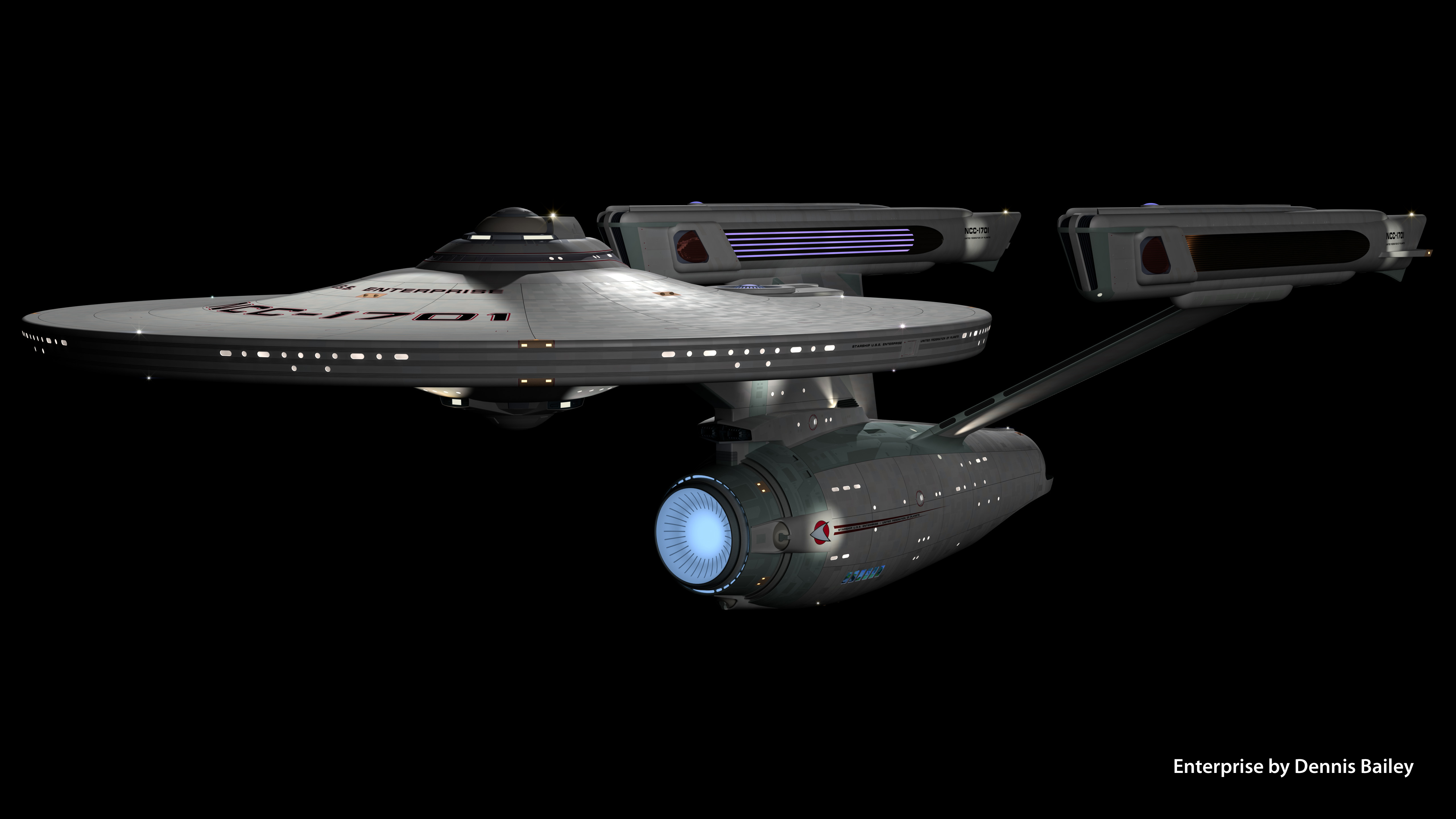
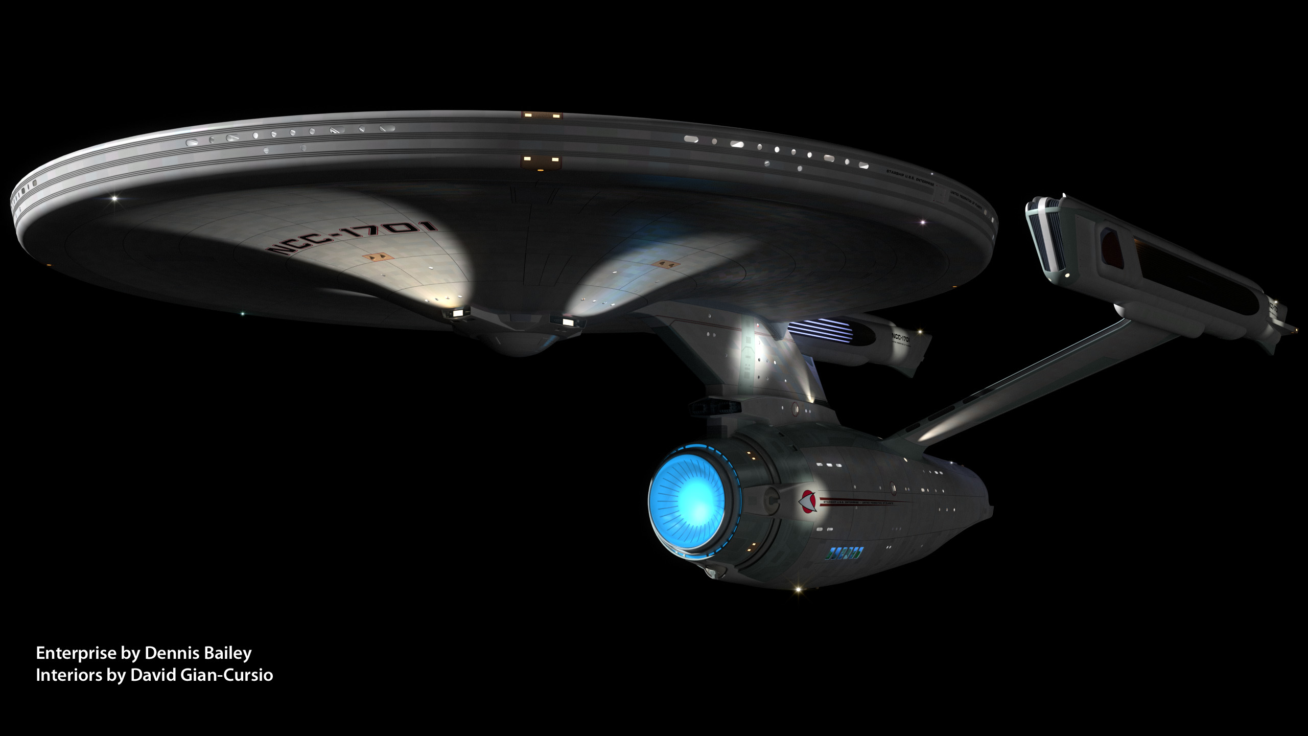
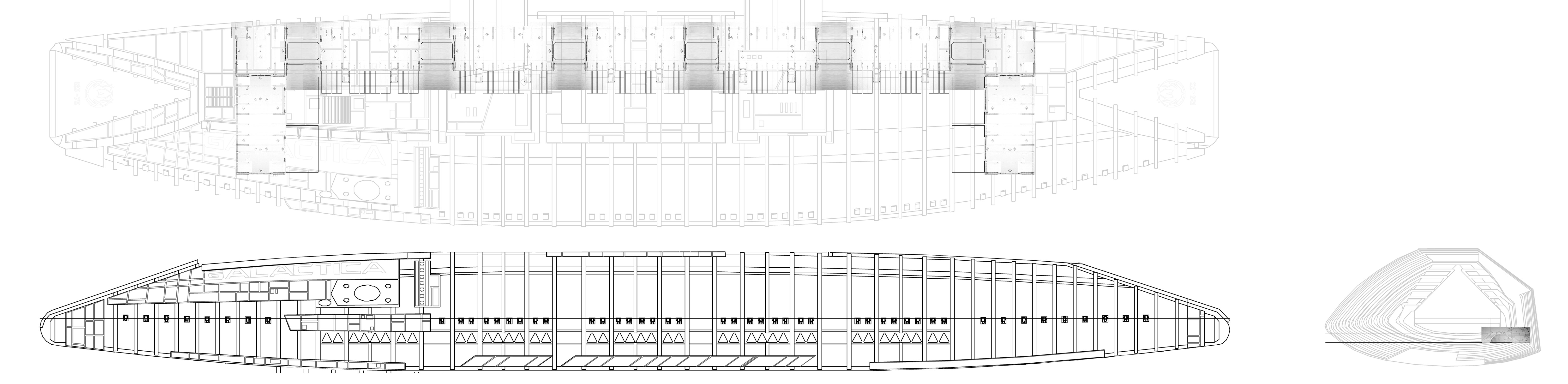
Exterior Model:

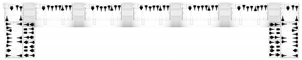
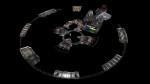
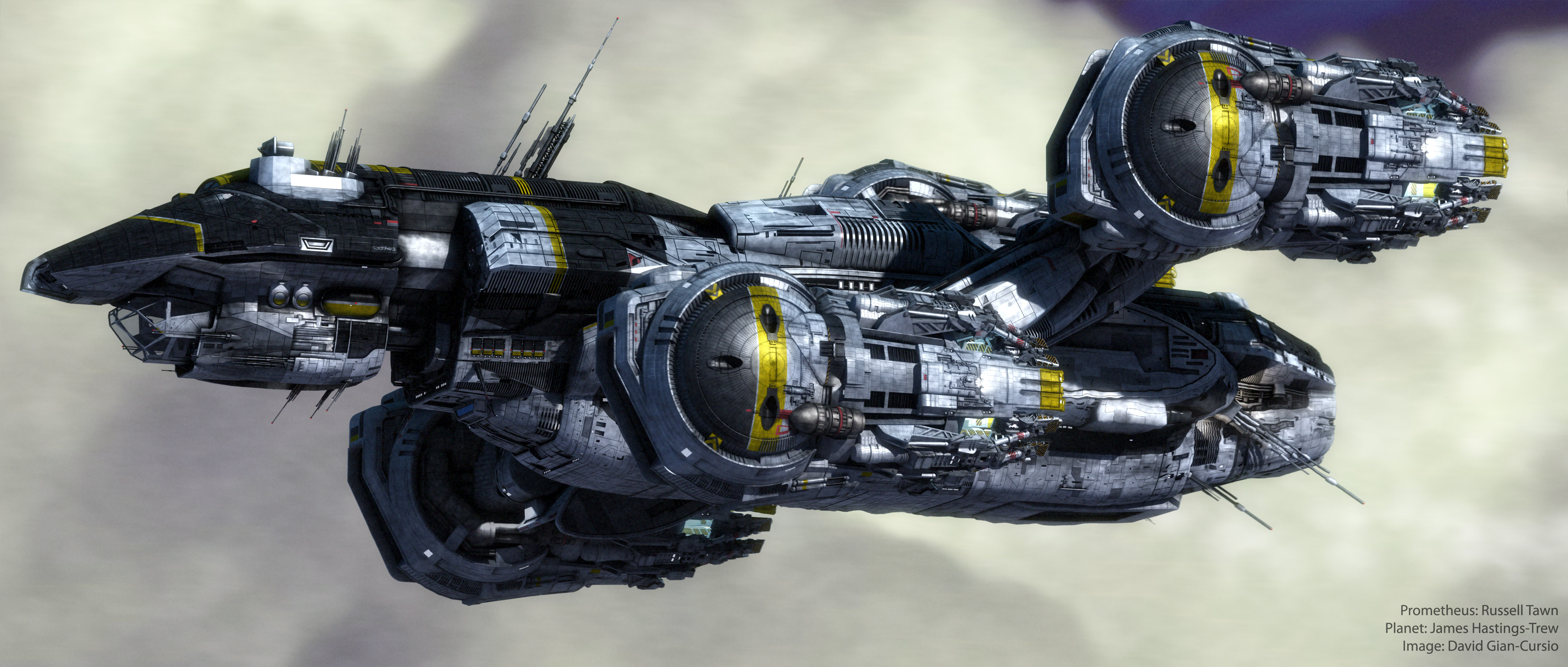
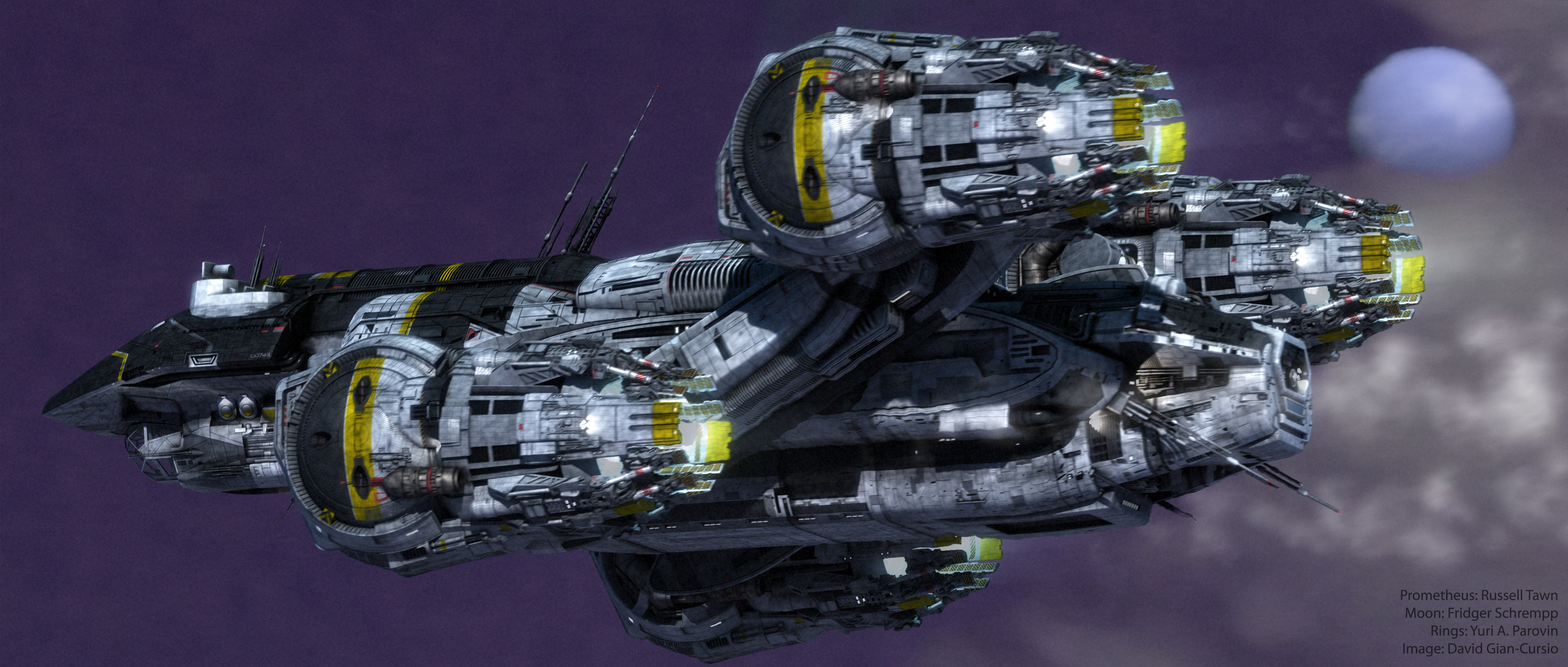
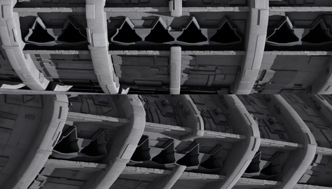
On the Galactica, there are five clusters of eight launch tubes each. Each cluster takes up four “frames” of the hull. The launch tubes in the cluster are arranged with two tubes, then a rib, then four tubes (with a cutout where the rib should be), another rib, and two more tubes. Each cluster is separated by a single empty frame.

Launch_Tube_Ext

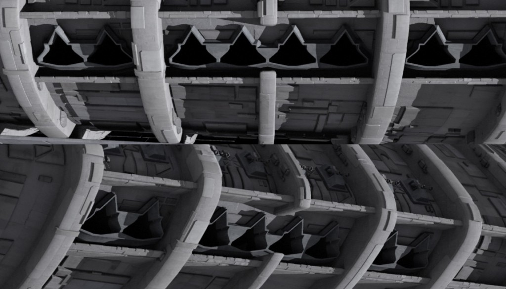
The landing deck of the flight pod has a series of regularly-spaced aircraft elevators. These elevators have taxi-lines connecting them to the runway, and have two square… things… in between each elevator.

Landing_Deck_Decal

204_cap483

There is also a dark grey line outlining the elevator. This is a railing that raises from the deck at certain stages of the elevator’s operation, to prevent hapless deckhands from falling in. This was inconsistently depicted during the show.

316_cap052

Battlestar_Galactica_Blood_and_Chrome_Unrated_Version_t00_Apr 17, 2013 12.04.42 AM

Synthesis:

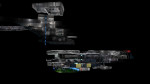
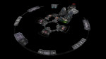
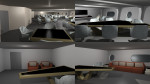
The set contains one half of an eight-tube cluster. It’s ambiguous if there are two tool rooms per cluster, but I’m going to go with there just being the one, since it gives more room for Vipers and Raptors, and while having one in each cluster is logical (no sense having to go over hill and dale to get a wrench because a Raptor is being launched and you can’t cut through the elevator), two seems redundant.

Each cluster is bookended by two aircraft elevators, including the outermost ones. That, along with the occasional presence of a bulkhead suggests there is an additional length of hangar, extending beyond the launch tubes and elevators. Budgetary restraints being what they are, the set representing it still had the launch tubes, though they were usually kept in shadow or off-camera during these scenes to downplay it. The shape of the flight pod suggests that they’re half-sized segments, since otherwise they’d be poking out of the hull as it tapers.

The simplest possibly would that the launch-tube side of the additional hangar area just mirrors the inner side, with Viper cubbies and a second-level walkway. Another possibility is suggested by Blood and Chrome, where a couple of shots show a large door identical to the ones that lead to the aircraft elevators on the outboard side of the hangar.

Battlestar_Galactica_Blood_and_Chrome_Unrated_Version_t00_Apr 16, 2013 11.27.14 PM

Apparently, they lead to more storage, since a later shot shows a pair of Landrams parked behind them. There are a couple of different way these endcaps might sprawl out behind those doors, such as having elevator-sized garages, or even a few additional identical sections of hangar.

I’m going to go with the most capacious option, since there are a lot of Vipers, Raptors, Landrams, and Forklifts that need to be stowed. And who knows where they put those shuttlecraft that are too long for the elevators and too tall for the hangar deck.

Here’s a layout of the Galactica’s port hangar deck, based on everything we’ve gone over so far.

G_Hangar_Layout

While I was drafting this, before I finished the illustrations, Lee Stringer added another image to his Flickr (hat-tip to Galactiguise for pointing it out) showing a cutaway of Galactica’s flight pod, explaining more artistically how the hangars, elevators, and launch tubes fit into the exterior model of the ship.

Incidentally, the elevators are numbered 1 through 6, from forward to aft. There are wayfinding signs throughout the hangar (such as HB1/04 or HB9/RB or HB1/34), but I’m going to punt dealing with them until I actually model the hangar, mostly because I can’t figure out how to make them consistent. Either HB# refers to the flight pod, in which case there’s only an HB1 and an HB2, and no HB9, and the second number goes up to 40-something or so, or HB refers the the clusters between the elevators, in which case the second number should never go above 8. And the second possibility leads to the question of whether the port and starboard pods share numbers, so there’s an HB1 in each, or if the starboard pod starts with HB7 and continues to HB12. I’m leaning towards the first option, if only because that’s what the leading zero in the second number but not the first suggests.

Capacity:

In the miniseries, Galactica’s starboard landing deck has been enclosed and converted into a museum. As part of the conversions, the starboard launch tubes were rendered unusable. This apparently was never repaired, and the starboard hangar deck was eventually used exclusively for civilian housing and, probably, Joe’s Bar.

In the second season of the show, the Battlestar Pegasus joined the fleet, and was revealed to have an on-board Viper factory. In season three, Pegasus was destroyed in a suicide mission, after off-loading her Vipers and most of her crew (and probably a ton of other useful supplies and weapons, given that no one ever complained about a shortage of nuclear weapons again). Considering the number of Vipers Pegasus already had on-hand, combined with whatever replacements they built after joining the Fleet, there’s only one reasonable conclusion: For the rest of the run of the show, Galactica had more Mark VII Vipers (and, probably, Raptors) than she could carry, especially with only one working flight-pod.

Behind-the-scenes information says that the Mark VII was harder to fly than the Mark II, since it was designed with computerized features that were removed after the Cylon attack. So, that would explain why Galactica continued operating the Mark II Vipers even when there were enough newer Vipers around to replace them. I’d assume the remaining Vipers and Raptors that didn’t fit on the hangar were either mothballed elsewhere on the ship or in the fleet or were disassembled for parts.

In the Season 4 episode where Galactica donates some Vipers to the Rebel Basestar for their attack on the Cylon Resurrection Hub, Starbuck mentions that half of their planes are with the Baseship, leaving them with 40 “birds,” which may or may not refer to both Vipers and Raptors. There didn’t seem to be much Raptor attrition after New Caprica, and about 16 Raptors jumped out of the starboard landing deck during the assault on the Colony in the finale (the camera move was very abrupt, so it’s hard to be sure, plus there may have been more Raptors that were left with the Rebel Baseship or launched more traditionally from the port pod), so let’s have that as a target, giving us a goal of at least 16 Raptors and between 64 and 80 Vipers in one pod. I began playing with my conjectural hangar layout to see how they might fit in. I tried to find permanent “parking spaces” for each craft, assuming that having them haphazardly floating around the deck isn’t how they’re supposed to be stored long-term, and was just an artifact of Galactica having constant flight operations. And given how often we saw the port hangar deck empty or nearly so (including Starbuck’s Earth-Viper apparently getting it’s own sealed section, because it was too creepy to let anyone fly), leaving some wiggle room so some segments could be filled past capacity while others were emptied makes sense.

G_Fighter_Storage

This possible layout has 79 Vipers, 21 Raptors, and 8 Landrams, which are close enough to the canonical figures that I’ll say it’s a reasonably accurate extrapolation of Galactica’s maximum air wing, operating one flight pod. Galactica’s present-day sister-ships seen in the Miniseries and Razor, assuming they didn’t preserve the multi-level Blood and Chrome-style hangar deck, would therefore have an air wing of around 200 planes, with about 160 Vipers and 40 Raptors.

Thanks to Lee Stringer, Galactiguise, and the Frak That screencap archive for making this post more possible and/or easier than produce it otherwise would’ve been.

Now I am an Architect

One day at Ninjaneer Studios, Joe Rosa called in to the office while off-site with a question. “Do you think we can do some architectural visualization?”

The response? “And how!”

We were given a floor plan and an example of a 3/4 aerial cutaway view of a home. I was assigned to the task.

Apartment1

The first step was to trace out the walls and extrude them into place. Once that was done, I filled in the lintels above the hallways and split out the different rooms and surfaces, assigning them loud, contrasting colors  so that I’d be able to differentiate them at a glance and would be less likely to forget to assign one a real texture later on than I would be if I left it at default grey.

Next, I began filling in furniture and other objects from our stock model library. A handful had to be tweaked to more closely resemble the illustrations on the floor plan, but I was able to match the original spec fairly closely. I then popped in some temporary lighting (just a single point source in each room on the ceiling).

Apartment2

Having roughed in the furniture, it was the work of moments to adjust the model to be used for the final cutaway view. The walls were clipped down to around 3/4 of their full height, and the camera moved outside of the structure. Once in the birds-eye view, I began applying rough texturing to the apartment. A turnaround was rendered, and this was the result.

Apartment3

It was missing a certain je ne sais quoi, and, not knowing what that could be, I FBX’d the model out of Lightwave and sent it over to Heather Knott, a professionally trained interior designer. She unclipped the walls and raised the camera, as the lowered wall height made the rooms look deceptively large, and replaced my haphazardly placed furniture with sets that actually looked of a piece, proving the importance of both teamwork and expertise

Apartment4

A version of this post appeared on the official Ninjaneer Studios blog.

We Do Not Have Time For Your Damned Hobby, Sir!

The Red Silk Thread is an opera by composer Stella Sung with libretto by Ernest Hilbert. It tells the story of Marco Polo’s return to Europe at the end of his famous voyages through Asia. This past April, a workshop performance took place at the University of Michigan, in advance of a full premiere at the University of Florida in April, 2014.

Ninjaneer Studios provided virtual sets for the Opera, projected behind the actors and used in place of physical scenery. There are six principle settings in the drama: the Court of Kublai Khan, the Gardens of Kublai Khan, a Chinese treasure ship at sail, the Court of the Persian King, a Genoese prison cell, and a desert dream-scape.

Thanks to my love of all things nautical, I immediately volunteered to take over the ship scene. The opera’s creative team had already put together some research on the types of boat they had in mind.

Junk1

I used this as a jumping-off point, and found additional materials. My primary reference ended up being a high-resolution photo of an exquisitely detailed model of a Ming Dynasty treasure ship. While this exact design is of dubious historicity, especially for an ocean voyage, and dates from at least a hundred years after Marco Polo died, information on the ships of his time was sketchy at best, and what I did find didn’t look nearly as impressive.

I began by roughing out the general shape of the hull in Lightwave Modeler. Even though the concept only called for the deck to be seen, I wanted to have at least a foundation for the exterior in case it was needed later. It also made it easier to ensure the deck was proportionate. I matched the camera angle as best I could to my reference photo in Lightwave Layout, and switched back and forth while adjusting the hull. I’ve found that while it isn’t a perfectly accurate technique compared to working off a set of orthographic schematics, it’s much better than eyeballing it.

Junk2

After completing the majority of the modeling, I began texturing the model, ending with populating the deck with various scenery objects

Junk3

I then presented Dr. Sung with a set of potential camera angles.

After getting the go-ahead for a 3/4 view towards aft, I began setting up the scene and lighting. The motion of the horizon was based on stock footage from a locked-off camera on the deck of a boat. A long-exposure photo of the night sky was used as a placeholder. I started with my standard ocean model, but had the usual problem with flickering as it got closer to the horizon. A combination of making the waves larger and rendering a limited region of the frame at a much higher resolution blunted the problem enough that it was no longer visible after post-processing.

The frame was split into several passes for rendering. This was primarily for efficiency, so only passes which required lengthy render processes like extreme antialiasing or multi-bounce radiosity would be put through them, and simpler elements could be rendered at reduced quality or, occasionally, as single frames.

Junk4

I prepared a test composite in Photoshop, which I passed along to Christopher Brown, who handled the compositing for all scenes in the opera. He built on my design, unifying it stylistically with the other scenes, and altering it to fit with the limited staging available for the workshop performance.

Initial Photoshop Test Composite

Initial Photoshop Test Composite

Final After Effects Composite

Final After Effects Composite

Over the next several months, all of us at Ninjaneer will be revising and expanding our virtual sets for the premiere at the University of Florida next year. I don’t want to ruin the surprises we’re planning, but I wouldn’t be surprised to see a few more ships in the Great Khan’s fleet.

A version of this post appeared on the official Ninjaneer Studios blog.

Wetter is Better

While working on a landscape for a forthcoming project at Ninjaneer Studios, I found that the animated reflections in some open water took prohibitively long to render thanks to a combination of the reflections and the diffused lighting of the scene. There had to be a quicker process that gave similar results, so I began investigating alternatives.

Render With Full Lighting and Raytraced Reflections

I found that Adobe After Effects has a filter called Displacement Map, allowing me to distort one layer based on another. One big drawback to this filter is the way it displaces, resulting in artifacts at the edge of the screen and other transparent areas where it attempts to sample data that is out-of-frame. This was easy enough to solve, but required some creative shot breakout.

Displacement Map (Note the ragged edges along the bottom and left sides)

Returning to Lightwave, I rendered out a reflection pass of the foreground elements. I changed the surfacing of the water so it was mirrored, deleted everything except the foreground elements, and set the foreground element to be unseen by the camera. This gave a pass consisting only of the reflection of the foreground, accounting for the perspective distortion in the reflection.

Thanks to the distance, there wasn’t enough perspective difference between the background and sky and their reflections to require a true reflection pass to be rendered, so I just reused those, flipped vertically. The clouds were a single panoramic plate, slowly receding, so those were likewise flipped vertically and layered into the basic reflection composite.

With the reflected version of the scene now created, all that remained was to make it look like water. I returned to Lightwave and rendered out basic diffusion and specularity passes from the original water object. To get the input for the distortion map, I created a duplicate of the water object and took surfacing in the bump channel and reapplied to to the color channel. After zeroing out the other channels and setting luminosity to 100%, I rendered it out, creating a shifting cloud pattern which corresponded perfectly to the diffusion and specularity passes I rendered earlier.

Diffusion, Specularity, and Bump Passes

Back in After Effects, I brought these passes in and layered them over the reflection composite I had created. I hid the bump layer and added an adjustment layer between the reflection elements and the diffuse and specularity layers. I applied a displacement map to it and set the bump layer as the input. All that remained was to tweak the horizontal and vertical displacement to make the reflection appropriately wavy.

The Final Post-Production Reflection

A version of this post appeared on the official Ninjaneer Studios blog.