100 Days, 100 Renders— Day 6

CDCR-006-Pike_at_Orion

As promised, another image from the days of Captain Pike. The background is a photo of the Orion Nebula I was pointed to by a blog post by the Bad Astronomer, Phil Plait.

I experimented with a variation of image-based lighting on this one. The only light source is the plane with the image of the nebula applied to it. I rendered it three times with the Photoshop render buffer export plug-in active, with the nebula set to different degrees of luminosity. I then mixed and matched passes from all three to get the final image to precisely control the look of the ship. The brightest version contributed the diffuse lighting, the medium version gave me the reflection and specularity, and the regular intensity supplied the nebula itself as it appears in the image.

While I was play with my post-processing, I experimented with a more intense, contrasty look than I usually go for, which reminded me of the original 1960s visual effects in Star Trek, and how the occasional astronomical background they used would look after being optically composited.

100 Days, 100 Renders— Day 5

CDCR-005-The_Cage

My original idea for my traveling project was to attack the most recent version of the Babylon 5 hyperspace effect on the plane ride, as seen in 2006’s “The Lost Tales.” It’s an intriguing mix of straightforward (since I can recognize it’s built out of standard Lightwave procedural textures and deformed geometry) and tricky (since there was only one shot of it in the movie, making it hard to deduce more specifics about it).

However, on Wednesday, it was announced that the new Star Trek television series, Discovery, would be taking place roughly a decade prior to the Original Series, during the same time as the adventures of Captain Pike. So instead, I spent my flight redressing Prologic9’s Constitution-class model to resemble the studio models that were used during the filming of Star Trek’s first pilot. My main sources of reference were screencaps from “The Cage,” the Casimiro blueprints, as well as this blog which goes into some detail on the different variations of the original Enterprise design seen over the course of 50 years of Star Trek. That’s where I learned about the blue tint on the ship’s neck which is an interesting variation on the design that I’m trying out. Other differences between the ship’s original version and the more familiar series configuration are a taller bridge, wider deflector dish, a different font for the hull markings, more decals on the top of the saucer, different endcaps on the tails of the nacelles, and gold spikes in the center of the forward nacelle domes. The model was originally unlit, and in the second pilot, while window lighting was added, the nacelle domes remained solid red. I’m assuming that’s why, when the visual effects of the original series were redone for the Blu-Ray release, the pilot version of the model had unlit domes, even though they did light the windows in “The Cage.” I disagree, and split the difference by darkening the domes and reducing their glow and transparency, but still allowing some of the series-style lighting effect through.

100 Days, 100 Renders— Day 4

TMP_Beyond_Launch

One of the ideas I’ve jotted down for this project is “Crazy, Star Trek Beyond wide-angle, upside-downy stuff,” which I have a feeling is a well I may visit more than once. Yesterday, I ended up with a bit less time to work than I hoped, since I decided to pull some reference material off of a blu-ray for a possible future modeling project and that took up a chunk of my 3D-time. I went with something quick-and-dirty, but it ended up looking pretty good. Star Trek Beyond had a fun shot of the Enterprise launching from a space station where the camera was locked at the base of the ship’s neck, and we see the lights of dock blur into a Quanstquatti-esque kaleidoscope as the ship accelerates past them. Continue reading

100 Days, 100 Renders— Day 3

CDCR-003_Y-Wing_Theft

And now, my first tiny render.

It’s probably not a coincidence that with my rendering fewer images, I haven’t developed a feel for render times using Lightwave’s new(ish) quality options. So far, I’ve worked on these pictures in the evening, rendered them overnight, and done the post-processing the following day. I ended up completely whiffing on my set-up when I started running the final image. Too many motion blur passes, and I also decided to throw in some global illumination just to give it that “This model was shot with plenty of fill light” motion-control look. When I got up and saw the render was nowhere near finished, I canceled it, reduced the resolution, cut down on the MB passes, and replaced the GI with a wacky constellation of spinning distant lights (which I believe was put up for download by Kat Myers originally) so I could get this out in a couple of hours. Continue reading

100 Days, 100 Renders— Day 2

CDCR-002a_Terror_off

I had the idea for this image a while ago, not long after I finished my Puddle Jumper model. As I recall, I got the idea looking at the cover of The Terror, a historical novel by Dan Simmons describing the horrible fate of the Franklin Expedition as the crew succumbs to the harsh environment and also some sort of bear-monster. I think that part was a metaphor for how we’ll never know entirely what happened to those people.

Anyway, I more-or-less saw it in my minds eye as you see it above. Crashed Puddle Jumper buried in the snow, askew Stargate in the background, a set of lonely, filled tracks marching back. My premise for the image is that the ship tried flying through an older gate, unaware that it had fallen prey to the elements in the years since it was last used. The Jumper emerged at an odd angle, the left wing clipped the ground and sheared off as it was extending, and the rest of it plowed into the snow a short distance away. Continue reading

100 Days, 100 Renders— Day 1


CDRD-001_White_Stars_Over_Planet_Credits

There’s an idea I’ve heard about, the Mind Palace. It’s a sort of memory exercise, where you imagine a building— library, museum, palace, whatever— and sort stuff you know information you know into different rooms. You take advantage of your brain’s natural tendency to form associations by tricking it into joining certain information to these imaginary rooms, so imagining the room also calls up everything you’ve “stored” in there. I’ve never had the patience to try it out myself, but I thought of it earlier yesterday, when I decided to embark on this project, and I found myself able to begin conjuring up shots in my minds eye, just like I used to years ago, as if the ability was behind a door in my mind I just hadn’t opened up in a while. Maybe I didn’t “lose” my mojo so much as was driven away from it. Continue reading

100 Days, 100 Renders— Day 0

For the next 100 days, August 8 to November 16, I am going to produce one 3D rendered scene every day.

There are too many reasons to do this.

That’s the only conclusion I can come to after many false starts to this introduction. Do I talk about the university drawing course that drained my mojo years ago? Maybe the rabbit hole I’ve kept falling into where I build models only to become bored with them once I’ve finished? The embarrassing experiments of the past week that prompted me to decide to re-focus on my fundamentals? The fact that lately all I seem to want to do is massive, ambitious projects I won’t complete without a grant and a support team? Or the time- and commitment-based projects that inspired me on this one?

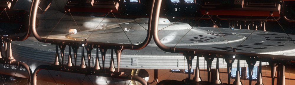
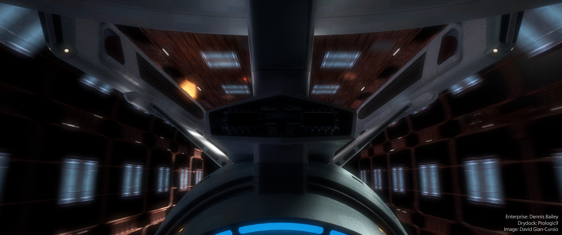
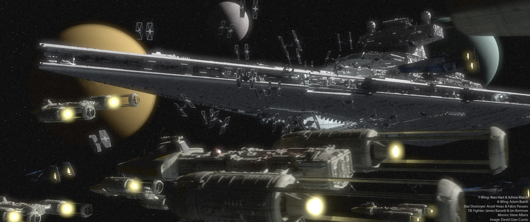
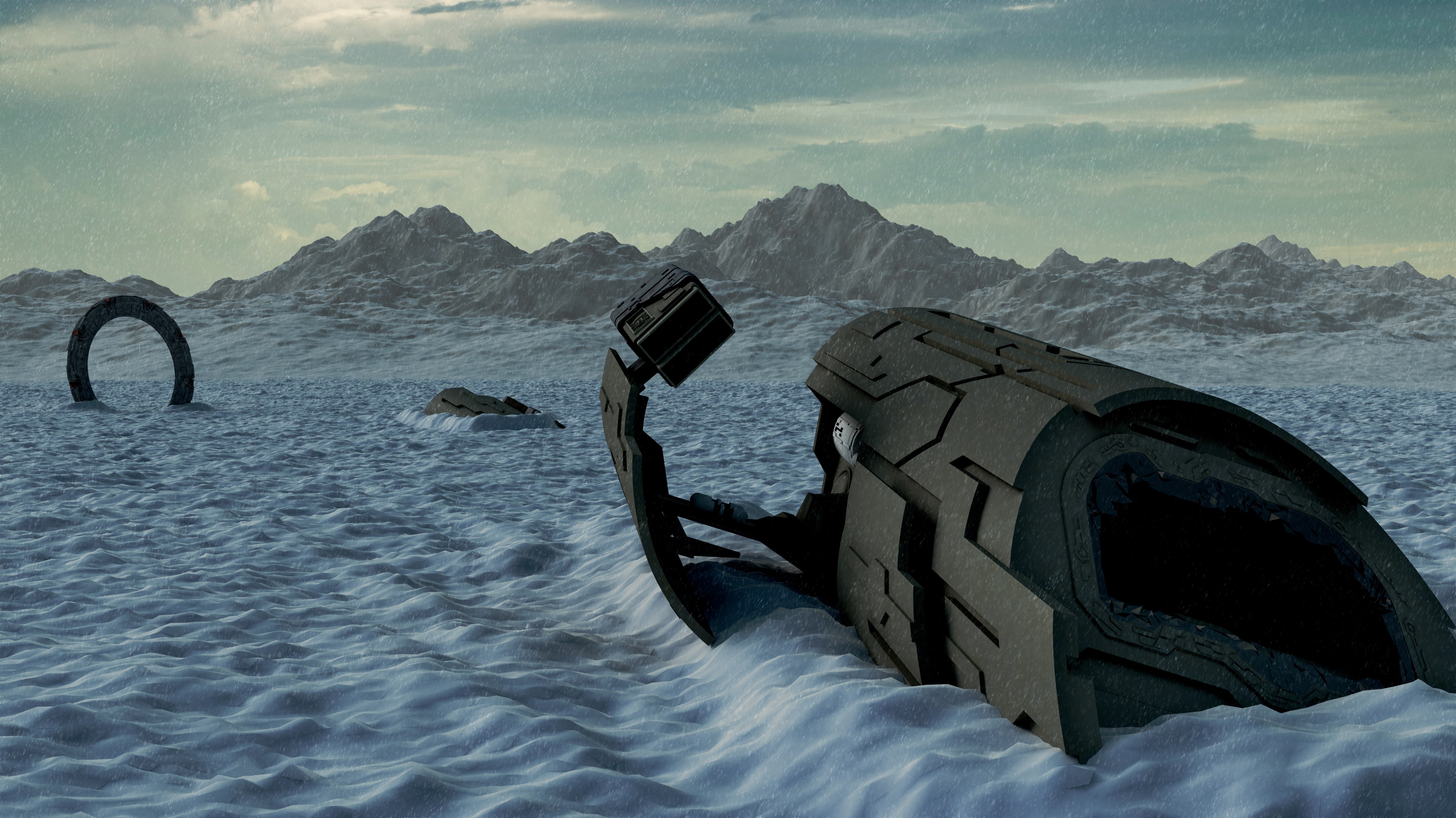
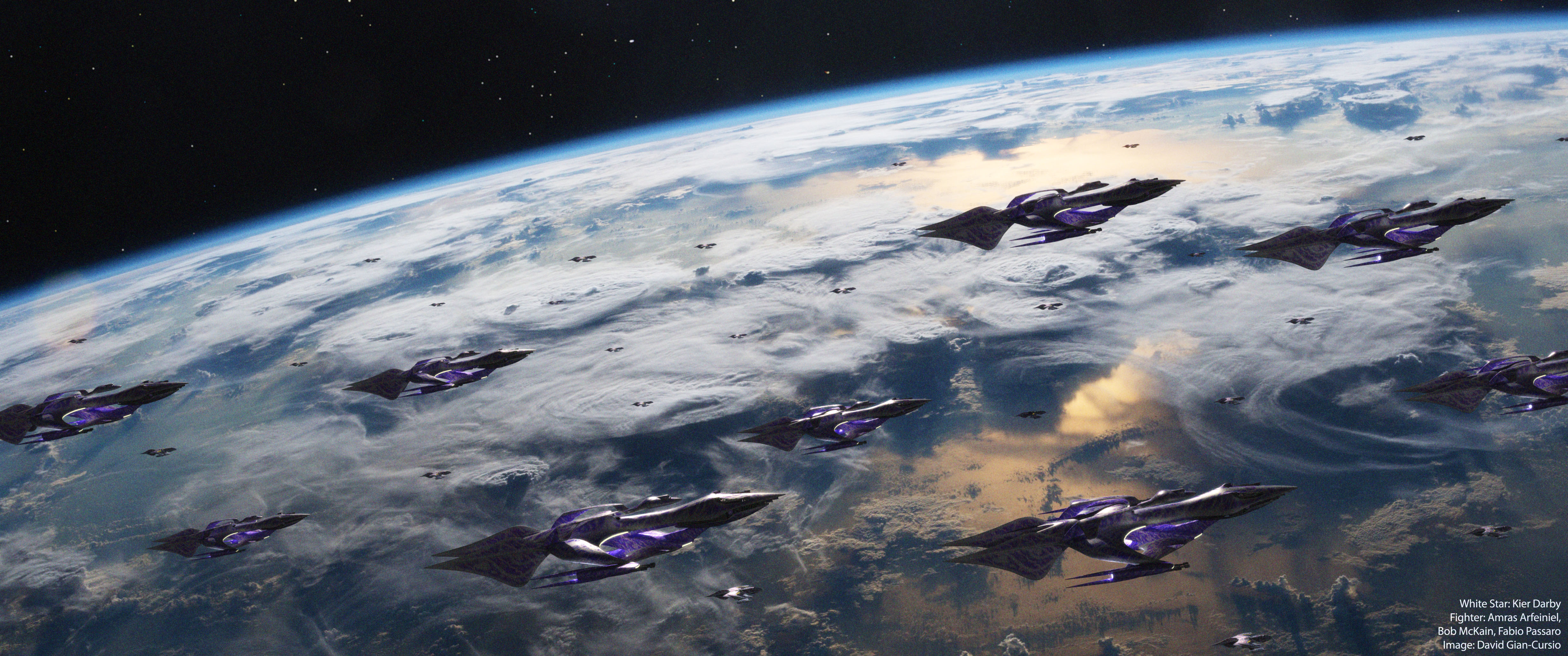
They’re all important, and they’re all interesting, and maybe I’ll go into all of them as time goes on. The one reason that fits into all of them is that I got into this line of work because I wanted to make cool pictures of spaceships, and it’s been ages since I produced enough images to count on one hand within a year. I want to tap back into why I started doing this, without worrying about any of the incidentals about what makes a good reel or sounds impressive in a job interview. The CG industry has not been kind to me, and I think it’s time I stopped worrying about what the industry thinks. As Douglas Adams wrote, “I’d rather be happy than right any day.”

So, what are the rules? Simple— The picture has to depict a scene of some sort. No area-lit models on soft gray backgrounds. Anything else goes. My hot-rodded Macbook Pro dates back to the last U.S. Presidential Administration, and based on Apple’s current pace of Mac upgrades, may end up outlasting the current one, so in the interests of actually being able to render a picture within 24 hours, I’m not placing a size minimum on this. I could end up with some crazy grainy postage-stamp picture if I aim for something with a lot of expensive effects, with layout screenshots so I can explain what it’s supposed to look like. I’ll try to keep my post-processing either non-destructive or well-documented re-renders at larger sizes are practical later on.

So. Here goes nothing.

Battlestar Pegasus DRADIS Screens

PDRAD_2D_WIP_20160726

A while ago, I made a set of icons for the DRADIS displays from the new Battlestar Galactica. Another artist contributed a recreation of the actual monitors, and I built on both to make computer screens for some cutscenes in the fan-made BSG video game, Diaspora. I figure sooner or later, I’ll probably need some more BSG computer screens using the design language from the Pegasus, rather than the Galactica. I’ve had some spare time recently, so I decided to recreate the DRADIS screens from the Pegasus.
Continue reading

There Are a Lot of Command Ships

A few days ago, the first teaser for the first Star Wars anthology movie, Rogue One, dropped.


There’s one shot in particular I’d like to talk about. You can probably guess what the shot is from my specialty, given how little space-stuff was in the trailer. First, some background.


R1vRotJTwo Star Destroyers, both alike in dignity…1As it happens the angle of the Star Destroyer shot in the Rogue One trailer is almost identical to the angle of the second shot in Return of the Jedi, so there’s a great comparison between the three-footer-inspired design and the eight-and-a-half foot miniature.


Continue reading

References
1 As it happens the angle of the Star Destroyer shot in the Rogue One trailer is almost identical to the angle of the second shot in Return of the Jedi, so there’s a great comparison between the three-footer-inspired design and the eight-and-a-half foot miniature.

Babylon 5 2×01 Effects Update Supplemental- Their Horses Were On Fire

With the Audio Guide to Babylon 5 getting into the third season of the show, and RedTed’s Babylon 5 model coming along nicely, I’ve been feeling more excitement about my old B5 effects project, which has been safely tucked in the back of my mind for the past few years. I think I’d like to take care of some more of the prerequisites before I jump back into making shots, not in the least because I’d also like to finish my current Star Trek project without introducing one of my trademark delays. I also think it’d be prudent for me to act as if this isn’t going to be a one-episode wonder, and take my time in laying the groundwork for continuing this project indefinitely.

Luckily, in my last post, I promised an investigation into the three depictions of the Battle of the Line in Babylon 5. I’d like to make all the depictions of the battle as consistent as possible, so I wanted to catalogue what happened, and which redone shots corresponded with which earlier shots. Let’s start with a chart of my findings, and then there will be some further discussion. I’ve listed the shots in chronological order.

Continue reading