Random Trek #86- “Time’s Arrow, Parts 1 & 2”

Random Trek 86: “Time’s Arrow Part 1 and 2” (TNG) with David Gian-Cursio

Random Trek 86: “Time’s Arrow Part 1 and 2” (TNG) with David Gian-Cursio

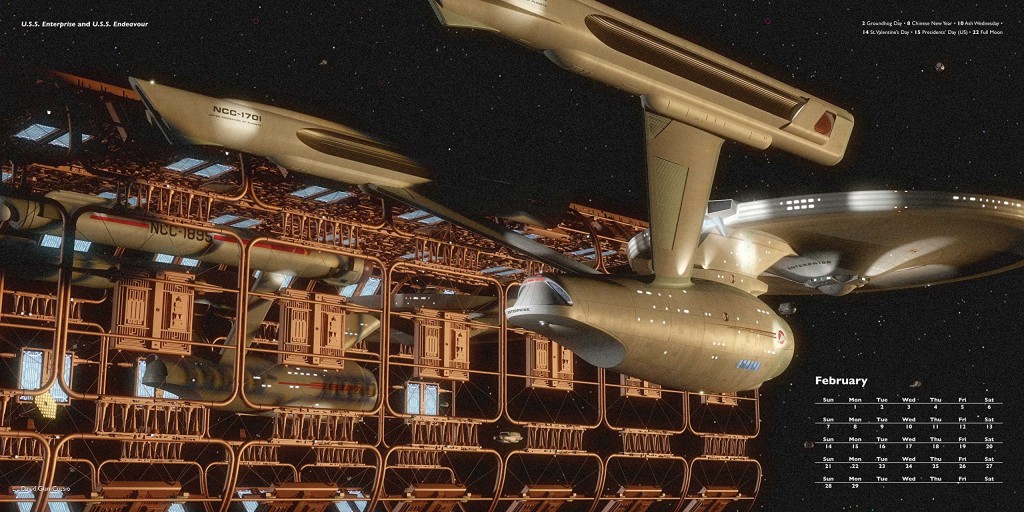
Back around Thanksgiving of 2015, I was listening to an episode of the podcast Random Trek, when the host, Scott McNulty, mentioned being a fan of the Ships of the Line art calendars. I tweeted him, mentioning that I’d be in the 2016 edition, and he invited me to appear on the show to coincide with my picture coming up.

The premise of Random Trek, simply put, is that Scott discusses a random episode of Star Trek with a non-random guest. As luck would have it, the random number generator gave us the episode “Time’s Arrow,” the two-part season-finalé/première of The Next Generation’s fifth and sixth seasons. As is Random Trek’s custom, this meant we recorded a double-length episode discussing both parts. And it’s a good thing, too, because we blew past a single episode’s runtime just discussing myself, the calendar, and nerding out on Star Trek in general. And I probably could’ve kept going, but I knew people came to hear about Data meeting Mark Twain, and not my many, many opinions on Star Trek.

To Random Trek listeners who are visiting for the first time, welcome! In the spirt of restraint and being a well-mannered guest, I didn’t pimp myself out too much on the air, but you’re on my website, now! Aside from the Ships of the Line 2016 calendar, some of my other notable works include my on-hiatus project to remake the visual effects of an episode of Babylon 5 (I’ll get back to it eventually), cutscenes for the fan-made Battlestar Galactica flight sim Diaspora, and contributions to various projects with Ninjaneer Studios, including a Ming treasure-ship for the opera The Red Silk Thread and a ruined city for the exhibit Corrosion: The Silent Menace at the Orlando Science Center (featuring TNG alum LeVar Burton).

If you’d like to keep up with me, my Twitter handle is @davidcgc, and I can often be found hanging around Foundation3D, the A.V. Club, and the TrekBBS.

In the spirit of providing added value, here are some notes and links related to things I mentioned on the show.

SotL_Feb_2016_Comparing_Notes_Amazon_Preview

“Comparing Notes,” as it appears in the calendar. Image courtesy of Amazon.com

Continue reading

Observational Humor

Recently, my friends Brandon and Dave (as well as their co-host Clay, who I haven’t met but seems like a fine person) began a podcast, Observational, where they discuss documentaries “that are fun, crazy, or mind blowing.” During the development process late last year, they asked me if I would create the album art for the show.

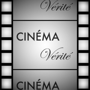
First, we brainstormed a few concepts which I sketched out on pen-and-paper (you can see how I sketch in earlier posts, so I don’t feel like I need to subject you to that again). I then created three mock-ups in Photoshop, using the show’s working title, “Cinéma Vérité,” so we could get a sense of how the real thing might look.


Projector 1

One used a simple film-camera icon with a light-beam coming out of it (which I realized while drawing it really made it more of a projector icon).


Shadow 1

Another, my personal favorite, had a movie screen, with the word “Cinéma” floating in front of it, casting a shadow which formed the word “Vérité.” I appreciated how the concept had levels, pointing out the illusion of cinema in the “This is Not a Pipe” sense, as well as more specifically how there is an inherent tension in the form of the documentary by using dramaturgical and storytelling devices (to different extent than written reporting) while presenting what may be taken to be an objective, factual account. The dichotomy between communicating truth through a medium consisting wholly of illusion is what I’m getting at, here.

If this concept went ahead, it was my intention to create it in 3D, so the lines of perspective and depth effects would match up more effectively than they do in this sketch.


I had another concept that drew on this idea, where a realistic silhouette of a bird in flight would be a shadow cast by a hand-puppet, but I couldn’t think of a way to arrange this in a square still frame that could be seen in forms as small as a postage stamp. It’d be easy enough to communicate the concept in an animated form, so I guess I’ve come up with my production logo, assuming no one else uses the idea in the meantime. Or has used it already, for that matter.


Flim Strip 1

The other alternative I offered was the title of the podcast on a film-strip background.


Just before presenting these, I was told the title of the podcast had been changed to “Observational,” so my shadow-casting idea was out, as it required two words. Of the remaining choices, the film-strip concept was the winner, and we went through the normal process of revisions.


Observational_Evolution

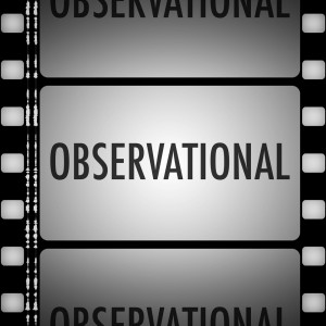
As you can see, after the rough size of the various elements was settled on, I moved to a more realistic design for the film strip for the production version, with properly-spaced sprockets and even a stereo soundtrack.


One thing I hadn’t anticipated was that the icon might be shown tiled on top of itself in a podcast client. When I downloaded the multiple consecutive episodes in Overcast, I realized that was a greater oversight than I had thought.

Overcast Old Icon

I went back to my laughably-named “Final” Photoshop file (one day, I’ll learn to stop using that word) and began adjusting it with tiling in mind. I made the sprockets along the sides take up an even amount of the frame, and adjusted the “film cells” in the center so the preceding and succeeding frames would be cut off in their center. I also added an additional gradient layer to the top and bottom frames to darken them evenly along the edge.

Overcast New Icon


And here, at long last, is the fina— that is to say, most current version.

Observational_Album_Art_Adjusted_2015-02-15

You can download Observational via iTunes, or wherever fine podcasts are available.