Observational Humor

Recently, my friends Brandon and Dave (as well as their co-host Clay, who I haven’t met but seems like a fine person) began a podcast, Observational, where they discuss documentaries “that are fun, crazy, or mind blowing.” During the development process late last year, they asked me if I would create the album art for the show.

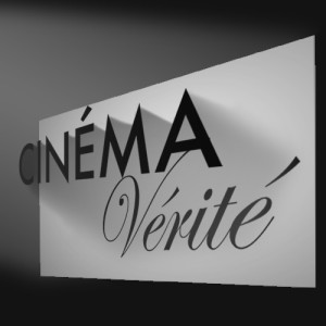
First, we brainstormed a few concepts which I sketched out on pen-and-paper (you can see how I sketch in earlier posts, so I don’t feel like I need to subject you to that again). I then created three mock-ups in Photoshop, using the show’s working title, “Cinéma Vérité,” so we could get a sense of how the real thing might look.


Projector 1

One used a simple film-camera icon with a light-beam coming out of it (which I realized while drawing it really made it more of a projector icon).


Shadow 1

Another, my personal favorite, had a movie screen, with the word “Cinéma” floating in front of it, casting a shadow which formed the word “Vérité.” I appreciated how the concept had levels, pointing out the illusion of cinema in the “This is Not a Pipe” sense, as well as more specifically how there is an inherent tension in the form of the documentary by using dramaturgical and storytelling devices (to different extent than written reporting) while presenting what may be taken to be an objective, factual account. The dichotomy between communicating truth through a medium consisting wholly of illusion is what I’m getting at, here.

If this concept went ahead, it was my intention to create it in 3D, so the lines of perspective and depth effects would match up more effectively than they do in this sketch.


I had another concept that drew on this idea, where a realistic silhouette of a bird in flight would be a shadow cast by a hand-puppet, but I couldn’t think of a way to arrange this in a square still frame that could be seen in forms as small as a postage stamp. It’d be easy enough to communicate the concept in an animated form, so I guess I’ve come up with my production logo, assuming no one else uses the idea in the meantime. Or has used it already, for that matter.


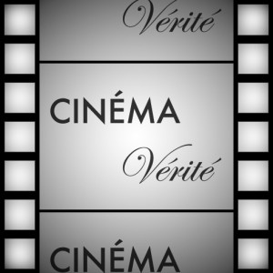
Flim Strip 1

The other alternative I offered was the title of the podcast on a film-strip background.


Just before presenting these, I was told the title of the podcast had been changed to “Observational,” so my shadow-casting idea was out, as it required two words. Of the remaining choices, the film-strip concept was the winner, and we went through the normal process of revisions.


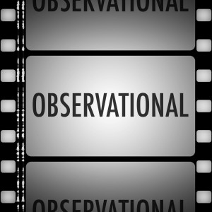
Observational_Evolution

As you can see, after the rough size of the various elements was settled on, I moved to a more realistic design for the film strip for the production version, with properly-spaced sprockets and even a stereo soundtrack.


One thing I hadn’t anticipated was that the icon might be shown tiled on top of itself in a podcast client. When I downloaded the multiple consecutive episodes in Overcast, I realized that was a greater oversight than I had thought.

Overcast Old Icon

I went back to my laughably-named “Final” Photoshop file (one day, I’ll learn to stop using that word) and began adjusting it with tiling in mind. I made the sprockets along the sides take up an even amount of the frame, and adjusted the “film cells” in the center so the preceding and succeeding frames would be cut off in their center. I also added an additional gradient layer to the top and bottom frames to darken them evenly along the edge.

Overcast New Icon


And here, at long last, is the fina— that is to say, most current version.

Observational_Album_Art_Adjusted_2015-02-15

You can download Observational via iTunes, or wherever fine podcasts are available.

Presenting “Blue Box,” the New Fragrance From Amy Pond

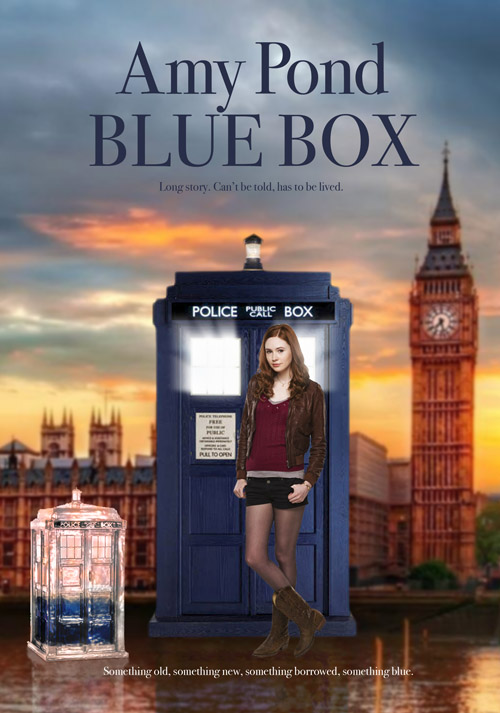
Let it be known that boredom, inspiration, and graphic design experience are a dangerous combination. In a recent episode of “Doctor Who,” we learned that the Doctor’s now-former companion, Amy Pond, had made it big as some sort of cosmetics or fashion designer, complete with her own line of perfume. On the TrekBBS, Samurai8472 made a post saying that this perfume ad would be a pretty good design for an Amy Pond ad.

I immediately saw where he was going with that (I hope), and started trolling the web for the necessary images (note to Karen Gillian: Please be photographed more in full body shots, against solid-colored backgrounds, while looking towards the camera. My options ended up a little limited). The central elements ended up being photos used for cardboard standees of Amy Pond and the TARDIS, this HDR image of London and this TARDIS inkbottle, which may or may not be a Photoshop. A few pixels pushed, et voilà.


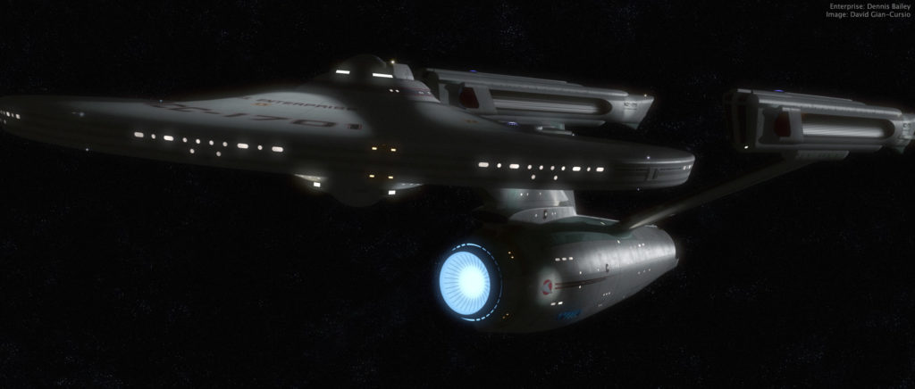
Just a quick refit-Enterprise beauty shot

(I just realized writing the topic, I really can’t call this ship “the movie Enterprise” anymore)


I suddenly felt the spirt move me today waiting for class to begin, and fired up Lightwave for a quick pic. I couldn’t have spent more than ten minutes setting up the camera and the key light (and most of that was fine-tuning the light to get a spec hit I liked). Since it was just me doing a quick little thing, I didn’t do a proper multi-file breakdown, but instead manually turned on and off each set of lights and glows to render out six layers (ambient occlusion, key diffusion, key spec, model glows, the model’s self-light rig, and the model’s lighting-rig’s lens flares), all saved as HDR .exr files.

I felt like trying something new, so rather than using my trusty old BetterSpace star field (first thing I ever made in Lightwave!) I gave Greg Martin’s photoshop star field a shot. It’s definitely different. More painterly than usual. Also, while I was looking it up, I saw Greg Martin’s doing a cool eight-planets multi-artist astronomical art thing that I thought was pretty inspiring.

Anywho, I adjusted and bloomed the heck out of all my passes, slapped in some film grain, and called it done. Well, there was a little more fine-tuning and experimentation involved than that makes it sound like, but it’s really more fun to do than it is to talk about.

Revamped Earth, because I can’t resist a bandwagon

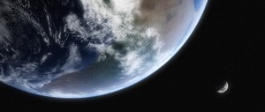
After seeing those sweet-looking new Earths in the Foundation3D WIP forum, I just had to get in on the action myself. I’d started to think my Earth, made from Dean Scott’s tutorial with the Blue Marble maps, looked cartoony, so I began fiddling with it.

I reduced the diffuse sharpness on the surface object so it would begin to shadow more quickly, making the clouds keep their brightness slightly farther into the night side. I darkened the surface, as well, so it was a bit less shiny and colorful. I also made the cloud layer brighter, and reduced the transparency of the atmosphere object away from the edges to help flatten the contrast of the planet.

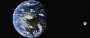
I also swapped out the moon map with a new one I found that didn’t have shadows on the craters (which kept making them look like domes unless I kept the camera and the sun light at specific angles), and I found where the high-res Blue Marble cloud data was hiding on-line. I needed to fill in the poles with cloned data from the regular resolution version on their website, and then I had to shrink it down so it would actually load, so it ended up being only negligibly larger than the version I’d been using. At least I have a 43,200 x 21,600 cloud map waiting for the happy day when my desktop replacement is replaced with a desktop and I have the kind of power I’d need to use it.

(Incidentally, the cloud map can be found here, in two 21,600 by 21,600 chunks. Here is the smaller version I used to fill in the missing data at the poles, rather than painting in my own.)

After I rendered out these shots in LightWave, I saved them as HDRIs, as is my custom, and brought them into Photoshop for my usual bloom-and-grain treatment.


Just so everyone can see the difference, here’s that last one twice more, first with my old Earth model, and second with the new one just as it came out of LightWave, with no post work.

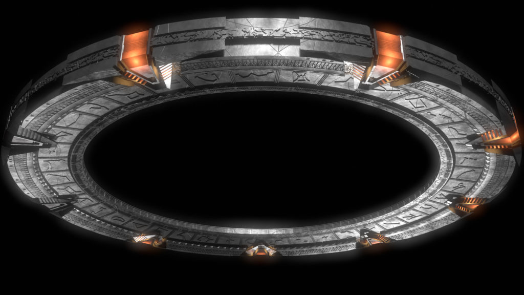
Movie-poster style Stargate image

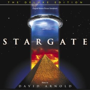
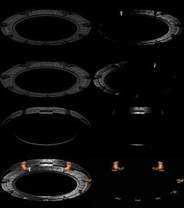
A while ago, I came up with the idea to try to recreate the image of the stargate used in the original movie poster in 1994. I finally got around to it after matching the angle last night for an AO render in the “New Headers” thread. To get that extra-shiny look, I rendered it in seven passes; three lights, each with a separate diffuse and specularity pass, plus one for the red chevron lights. I saved them all as HDRIs, and put them together in Photoshop, adjusting the gamma and exposure of each layer, with blending mode set to “Linear Dodge (Add).” Once I had it the way I liked it, I merged them together into a single HDR layer, and used that to make the bloom effect. I think it’s a little strong, but that’s why we’ve got layers. I can fiddle with it more if I want to use it in the future.

I’m not sure if I’ll ever end up using the image for anything, but it ended up being a pretty fun exercise.


The reference image


The final product


Breakdown of the component passes

Charting the Crucible

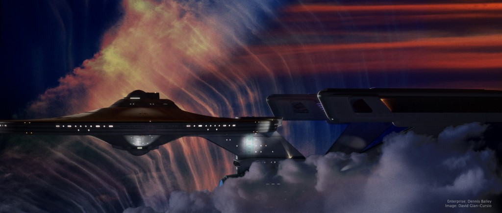
This picture was inspired by a shot in early season 3 of Battlestar Galactica, where Galactica emerges from behind a cloud in a nebula, looking for all the world like a seaship emerging from a fogbank. I decided some time ago that the movie-era Enterprise would be a perfect ship for my own take on the shot, given that it’s my favorite spaceship and that it’s long, sleek profile means it’d fit well in the aspect ratio I normally use.

The nebula background (and foreground) was a composite of four photos of clouds I’ve taken over the years (and anyone who’s ever seen me while I’m holding a camera can tell you that I photograph a lot of clouds), colored, mixed, and generally fussed with in Photoshop. I did a good deal of fiddling with the bloom and fog depth effects on the ship as well, until I was happy with them. I quite like the colors in this picture, and it’s one of my new favorites. And any day I can look at a picture and think “new favorite” is a good day.

As for the narrative of the image, all I can say is, it’s not from The Wrath of Khan. It’s a nice, peaceful image of the starship Enterprise exploring another, completely unrelated nebula. I know it looks like the nebula from The Wrath of Khan but, well, it’s not. Because I said so.


Added July 11, 2008

In light of the interest this picture has gotten, I’m putting up a quarter-sized version of the final Photoshop file, as well as the source files I used to create it, for others to examine for self-educational purposes.

On the nebula effects:
The first thing I did was put in the foreground cloud. I cut it out using a layer mask that I made from selecting the color of the sky, because there was a pretty clean division and I’m far, far too lazy to matte by hand when I don’t absolutely have to. I used an adjustment layer to give it it’s color, and then another photo of a sunset to break up its color a little. I used the same layer mask to block out these two layers, as well as the bloom layer for the ship.

For the bottom layer of the background nebula, I started with a light, whispy photo of clouds, with the opacity turned down a smidge so the black background layer would darken it up a little. Then came an adjustment layer the same color as the one for the foreground cloud, with this one set to “Linear Burn” in the blending mode to darken it up, and the “Blend if” box in the blending options being set to reduce the blending as the underlying layer got brighter. This set off the clouds in that picture more from the sky. I used the same sunset again to alter the color of this part of the clouds in the next layer up, this one set to “Vivid Light.” The topmost layer was another sunset photo, with smooth bands of red clouds, that I placed in the upper right to help justify the red light on the top of the ship. That one was matted in with a layer mask as well, with much tweaking of its levels so the red part would show up but not the sky behind it.

After I’d done all this, I still didn’t feel like it was quite done. Eventually, I realized what was missing and ran back to Lightwave to render out a depth pass of the ship using the Render Buffer Export. I used that as a layer mask on the ship layer, which helped sell that it was traveling through a gaseous medium (it’s most apparent where you can see the foreground warp engine overlap the background one, but it affected the whole ship.) The topmost layer was a merged version of the image, with a filmgrain-and-blur applied, and then darkened substantially with levels, and set to about 50% opacity.

—–

It took some doing to matte in the cloud without getting a black edge of what used to be sky. Even once I’d pulled that out, I found that the thick, full feel of the cloud completely broke with the thin, wispy clouds I used in the background. I didn’t really have a more suitable cloud, and didn’t want to render a 3D one for time and aesthetic reasons, and the composition didn’t work if I took it out all together, so I made it fit more with the background by giving it some of the same color variation. It still wasn’t perfect, but it served its purpose of framing the ship.

———-

On the appearance of the ship:
I think that feeling of solidity came out in Photoshop. The lighting was pretty basic, all told. The model’s rig, along with a small white area light at about ten o’clock for the rim light, a large red area light high and past the model, and a bluish area light behind and below the camera. (I also rendered the image with “Final Gather” radiosity enabled.)

Turning layers on and off, it seems that the CGI went away with the top layer, which was duplicate of the merged image, with film grain applied and the levels adjusted so the whole ship was almost entirely black, and then reduced it to 50% opacity.

The Stolen Earth

“Do you know what, I look up and there’s all these moons and things, have you seen them? Do ya see ’em? What was I drinking last night? Furniture polish?”
“Ianto! Time and a place!”
“Yeah, it’s funny though.”

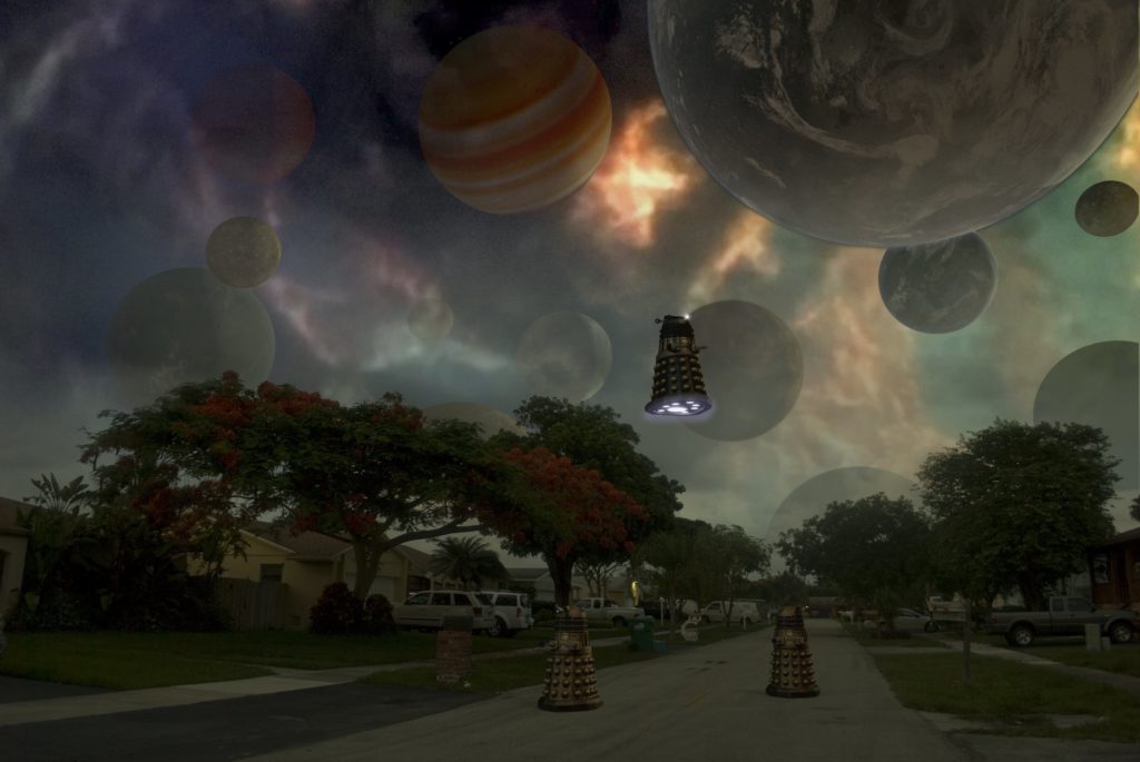
The impetus for this picture was a comment on a web-board where someone mentioned that they’d like a wallpaper-sized version of one the scene with the planets above the streetscape at the beginning of “The Stolen Earth.” After pointing out that since Doctor Who isn’t made in HD, there isn’t enough resolution in any version of the scene for it to work, I (and my massive ego) realized that I did not have the same limitation. And, hey, any excuse to fire up Layout.

I went out onto my street just after the sun had set, so I could get some appropriately dim yet not completely dark lighting. I then matched the perspective in Lightwave, and rendered the Daleks and the planets separately. I decided to give the Supreme Dalek who’s lording it over everyone an extra gun just to mix it up a little. As for the planets, I pretty much picked out anything I had that wouldn’t be a recognizable real planet and tossed it into the sky.

The real fun was in Photoshop, where I changed the white balance in the original photo (which had a heavy blue cast from the dusk light), pulled out the sky, put the sky back in a little to form a sort of haze because the gaps in the trees were giving me trouble, added in the Medusa Cascade from a screencap, and faded the planets in different amounts to give it the appearance of depth. I then fiddled with it on and off for the better part of a day before deciding it wasn’t getting better anymore, just different, and decided it was time to post it.

Kicking Toasters In The New Old-Fashioned Way

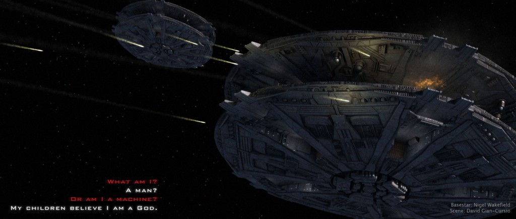
So, here we have my next step in the wide world of explosions, from the explosion-and-smoke-filled universe of the new Battlestar Galactica using Raffs’ excellent Cylon Basestar. Rendered in Lightwave, with all of the effects done in-camera (so to speak) with particles and hypervoxels.

The picture actually started life some four weeks ago. It was originally going to be poster-sized, with three Basestars in various states of explosion. As time went on and I continued to finesse the shells and fireballs, I slowly found myself losing interest. Rather than dropping the picture, I repurposed it, changing the framing and reducing the image size to my old standby, losing one of the Basestars, and having only a little bit of explosion in the hopes it would finish rendering before I completed my higher education. I gave it a once-over in Photoshop to add some bloom and improve the color of it, along with a pass of film grain (followed by a .5 pixel gaussian blur, so the film grain actually looked like film grain and not weird pixelated distortion).

I considered having some missiles coming out of the Basestars, but decided against it because, like I said, I wanted to be done. I’ll make a missile setup later, in all likelihood.

The backstory to the image is that it’s from the battle in the flashback sequence of “Battlestar Galactica: Razor.” While the Cylons were focusing on the Battlestar Columbia, the other two Battlestars had the chance to switch from defensive to offensive fire, and this is their first salvo headed for the Cylon Basestars. The quote is something that will later be said by what these Cylons were fighting to the death to protect.

Saturn, Saturn, and More Saturn!

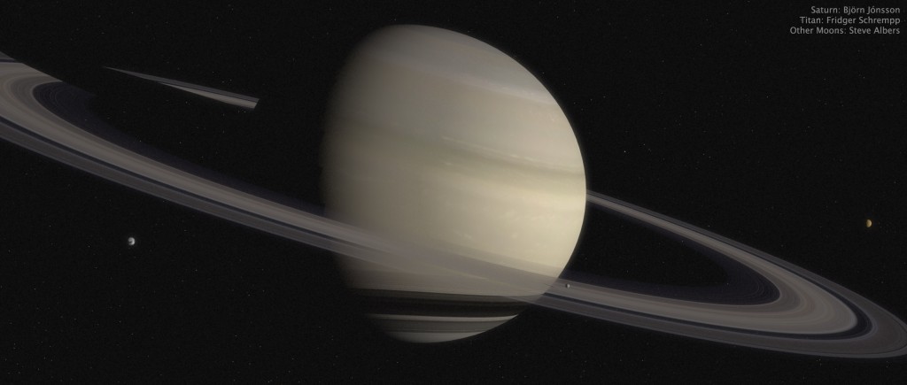
I recently realized that I’d been putting off making a scene of Saturn, even though I knew what I had to do to make it work. Seizing the opportunity to do some work in Layout again, I made a scale reproduction of Saturn, it’s rings, and five or six moons (the ones I found good maps for). I’ve already made similar set-ups for Jupiter and Earth. While I was working on it, I came up with ideas for three pictures using it, so here they are.

“Gossamer” is just a beauty shot of the planet.


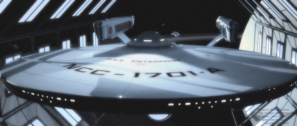
“Take Us Out” is a Star Trek picture that’s something of a riff on the end of the computer game “Starfleet Academy,” where the Enterprise-A is seen in drydock around Saturn.


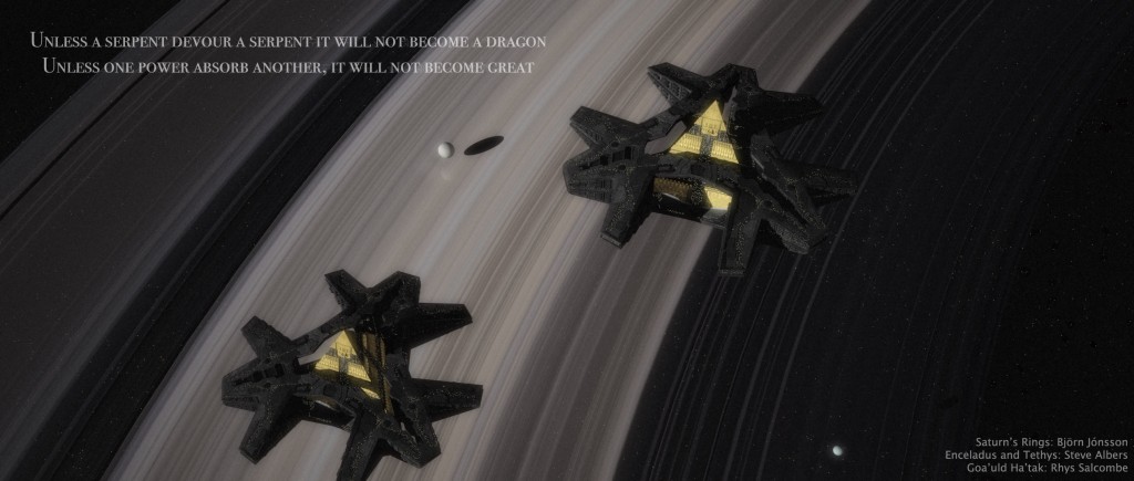
“Ouroboros” is a Stargate SG-1 picture, based off the first season cliffhanger. I felt like the the picture needed a quote, but I couldn’t think of anything specific, so I searched Google for quotes relating to the word “serpent” until I found something that was apropos to the situation.

Serenity Liftoff

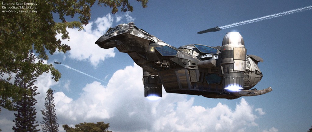
Now, this picture was an interesting one for me to make, since I tried a few new things. The contrails were a first for me, and I’m happy with how they turned out. The heat ripples coming out of Serenity’s engines also worked well. After a little polishing in Photoshop so the rendered elements blended in with the photographed stuff, I’m ready to call it done.