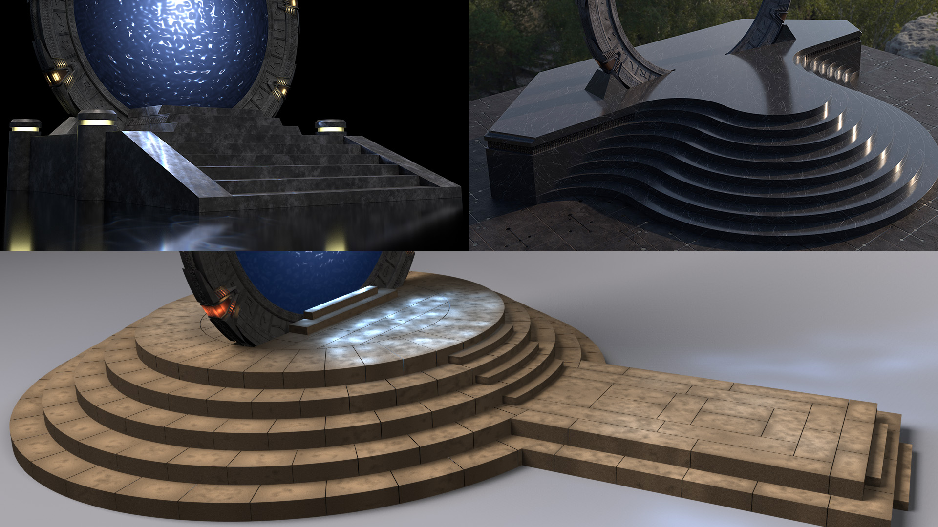
“Stargate Accessory Pack 1” for Lightwave 2020 (FBX & OBJ Included), Released November 3, 2023—17 MB
Continue reading
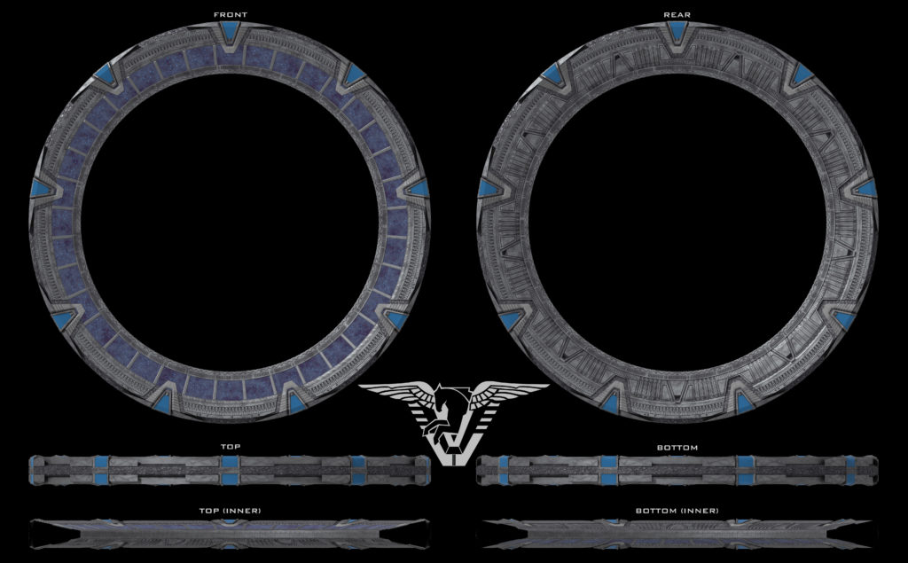
“Stargate 3.1 (Pegasus Version)” for Lightwave 2020, Released July 30, 2021 (CC0) —53 MB
After over a year, I’ve reached the end of my 2020 pandemic modeling project with the completion of the version of the stargate used in Stargate Atlantis. Alongside the movie and SG-1 versions, that makes a complete set for this basic design.2The Universe version being a totally different design, and the Origins version being intended to match the movie version, even if it didn’t quite hit the mark perfectly. While I don’t think I’m quite done with Stargate just yet, I’m probably done with modeling actual stargates for a while.
Continue reading
| ↑1 | Atlantis Expedition Logo by CmdrKerner |
|---|---|
| ↑2 | The Universe version being a totally different design, and the Origins version being intended to match the movie version, even if it didn’t quite hit the mark perfectly. |
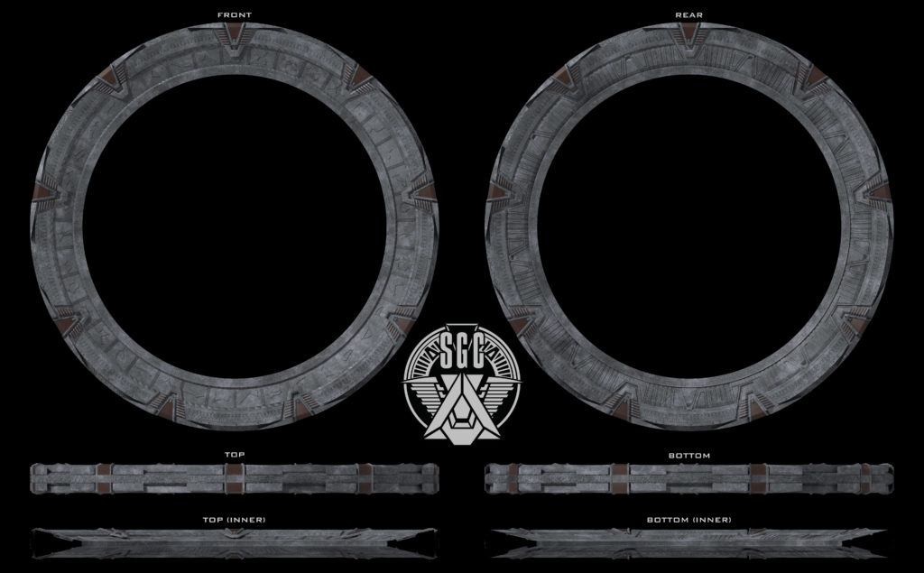
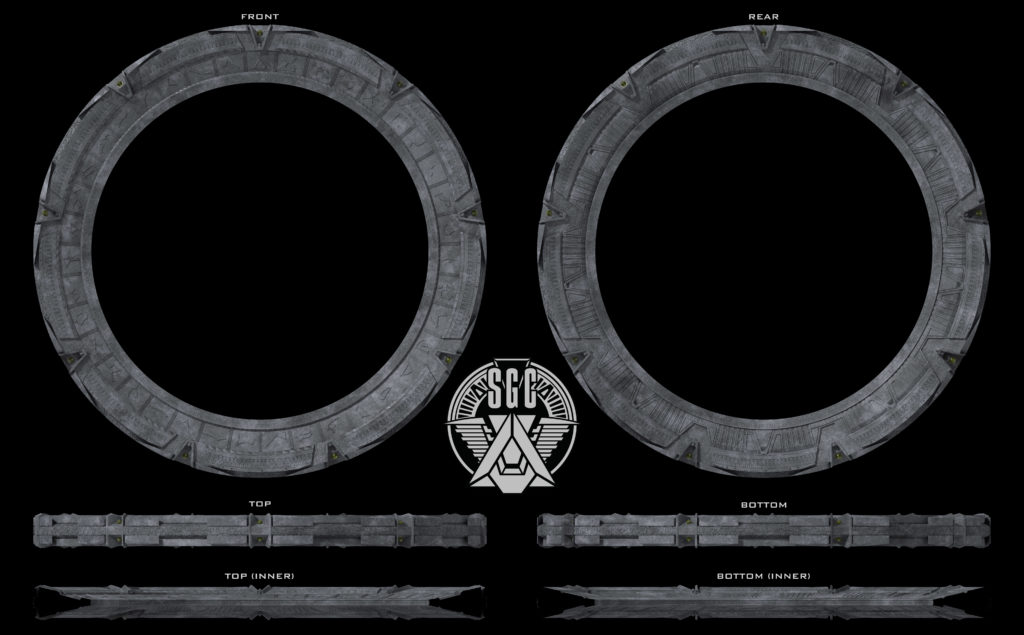
“Stargate 3.0 (Milky Way Version)” for Lightwave 2020, Released March 28, 2021 (CC0) —80 MB
Continuing with my work on building a new stargate model, and in advance of the Atlantis-style ‘gate, we have the flagship version, the stargate as it appeared in the series Stargate SG-1, give a take a few alterations and enhancements.
Continue reading
| ↑1 | SGC Logo by mikepjr |
|---|

“SGC Logo Plaque” for Lightwave 2020 (FBX & OBJ Included), Released March 15, 2021 (CC0)—279 KB
As a quick little side-project, the other night I built the SGC Plaque. Joseph Mallozzi, who was a writer and producer on the TV shows, has been posting high-res behind-the-scenes photos, concept art, and documents since the shows were still on the air, and recently posted a construction diagram of the plaque, which made it pretty easy to model in only an hour or two, most of which was spent squinting at the measurements and comparing with some photos of the finished plaque to see how things changed between the drawing and the actual piece.
There was also a 3D rendered version used on the show as a screensaver and decorative element on computer displays which was colored differently, so I made both versions. I didn’t sweat getting the textures exactly right (and there were some shape differences with the digital version I didn’t bother changing), just going for the spirt instead of a perfect duplicate. The gaudy ’90s texturing is pretty rough, and now we’ve entered a glorious era where flat color in CGI actually look okay.



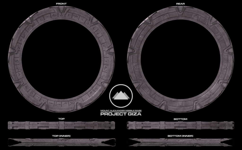
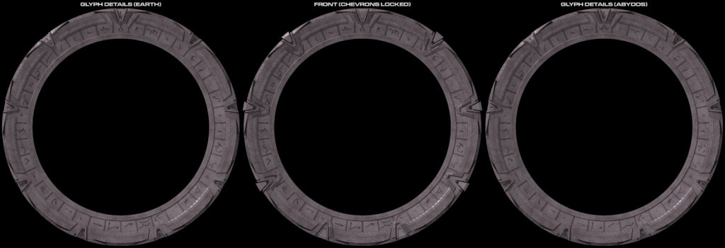
“Stargate 3.1 (Film Version)” for Lightwave 2020, Released March 22, 2021 (CC0) —44 MB
Conversion Kits:
FBX Version (CC0)—78 MB
FBX Animation Templates (CC0)—0.1 MB
OBJ Version (CC0)—87 MB
Texture Reference (CC0)—24 MB
Since last summer, I’ve been working on a new 3D model of the stargate in Lightwave, my third attempt. Since I last built a stargate model in 2006 (with small updates afterward), my skill as a modeler has increased, and reference material is far more plentiful. That includes behind-the-scenes photos, low-res but still useful construction diagrams from auction websites, HD home video releases of the movies and television shows, and, most importantly, high-res photos from Les Enfants de Mac Gyver, a group creating a duplicate of the SG-1 stargate setpiece using pieces of the screen-used version purchased at auction as well as their own copious research. There are many sections of this model where I simply wouldn’t have been able to even guess at what went where without their detailed and plentiful photos of their stargate being assembled, disassembled, and otherwise worked on.
Continue reading“Hyperspace” for Lightwave 3D, released August 25, 2016 – 0.7 MB
Based on the “quantum space” environment seen in Babylon 5: The Lost Tales, this archive includes both the blue-colored quantum space as well as the original red-tinted hyperspace of Babylon 5.
Comparison of my model with Masao Okazaki’s original schematic drawing
Download Lightwave 2015 Version
The Archer-class starship is a small TOS-era scout designed by Masao Okazaki for the Star Trek: Vanguard novels created by David Mack, Dayton Ward & Kevin Dilmore, and Marco Palmieri. I began the model some time ago, after getting the idea of doing an opening credits sequence animation for the then-recently-announced Star Trek: Seekers spin-off series.
Last year, around the time the 5K iMac and 2016 Ships of the Line calendar contest were announced, I got the idea of making window boxes for Dennis Bailey’s refit-Enterprise model so as to show more detail in the high-resolution images of the future. This has been my favorite science fiction design for as long as I can remember, so simple textured boxes were right out. I wanted to have furniture, even crew people visible through the windows. It took a while but, the results were worth it.
The layout of the rooms is based more-or-less on the Strategic Designs blueprint set, with some details from Mr. Scott’s Guide to the Enterprise and my own interpretations.
The model includes three swappable objects, based on locations that changed between the original Enterprise and the A. The officer’s lounge under the bridge can be replaced with a dining room, the large shuttlebay from TMP can be swapped for the enclosed version from TFF, and the swirling, gaseous warp core from the early movies can exchanged for the pulsing TNG model. The idea is that I could easily mix-and-match to represent other Constitution-class ships of varying configurations. I’m a big fan of the idea that sister-ships shouldn’t be perfectly identical except for the name painted on the front.
The whole configuration also comes in two versions, one in smooth earth-tones as the original Enterprise appeared in the first three movies, and one with more greeblies and silver and blue-gray coloring as the Enterprise-A appeared in The Undiscovered Country.
The crew people are very low-detail, little more than stick figures, but come in male and female, and have various skin tones and hair colors. I also set them up so it was simple to change the style of their uniforms, from the movie-era all the way to the various TNG-era uniforms.
The only drawback is that the lighting for the windows is a little dim compared to the official model, but I’ve been rendering in passes for years anyway, so it isn’t any trouble to brighten up the windows after the fact.
I included some small shots from inside the rooms but, to be clear, this is an exterior-only model. It’s no secret that interiors and exteriors for buildings and vehicles in film rarely match up perfectly, and these are no exception, with compromises made for the Recreation Deck, the Cargo Bay, and the height of all the rooms along the saucer’s edge, especially. Anyone building a model of the interiors of the movie-era Enterprise would have to ignore the outer shape of the ship to get those to look correct. The shuttlebay observation galleries being a half-deck below the window line on the exterior ship could be argued to be a feature of the “real” ship, but I’m not sure I like it.
After I finished the interior, I decided to gussy up the texturing on the main model, as well. I’ve been fiddling with the textures and lighting setup since I first downloaded it, but this time I set out to match the reflective, pearlescent paint job the studio model had for the first Star Trek movie. It ended up being surprisingly straightforward to get multi-colored highlights out of the model’s original textures, and adding reflectivity to the surfaces also required only a little trial-and-error to nail down.
I’ve rendered off shots from three angles so you compare Dennis’s original model to all the stuff I’ve done to it.
My version is on the left, the original on the right.
And here are some full-sized versions of my revamp for you.
You can see more work-in-progress images and read more details about the creation of model in this thread at Foundation3D. The model itself, along with an FBX conversion, and just the crew figures, is also available for download there. You’ll have to modify Dennis’s model to use them, which is why they’re in the “unfinished” section of F3D, but the Read Me explains what you need to look for.
You can also download them here:
Over at Foundation3D, a new downloads category opened up for unfinished models. A couple days after seeing the thread, I remembered that I had a very rough version of the hangar deck from the 2003 version of Battlestar Galactica, and also the foundation for the Halo: Reach version of the Pillar of Autumn. I’d finished the initial work for both, which is usually the part of modeling that gives me the most trouble, but I’d also burned out on them getting that far and moved on to other things.
I uploaded both of them. The Autumn includes a large number of screencaps from Reach, a few downloaded from the internet, but most I took myself to use as reference for the project.
The hangar was actually for a school assignment, to match a professionally made 3D rendered environment, either a virtual set or something from an animated film.
You can download the Pillar of Autumn and hangar (local mirror) from Foundation3D. The models are in Lightwave format, though I included OBJ versions for users of other packages. All I ask is that if you let me know if you do anything with them. I still have a few images in mind that I’d like to make with these objects.
As an aside, the reason I was looking at my hangar model was that I was playing with some of the new BSG designs from Blood and Chrome and comparing them to the parent show. While doing that, I did some scaling with the new Viper (based on a production diagram posted by Doug Drexler) and found out that it’s a big sucker (10.6 meters long, with a 6.8 meter wingspan). I thought I may have made a mistake, but the cockpit matches the size of the cockpit on the Mark II version, and they seem to be using the second Mark II cockpit set from BSG without any modifications, so they should take up the same space.
The Puddle Jumper model includes an Ancient drone and an extremely low-detail interior. And copy of my unfinished high-detail interior is included for anyone who would like to have a go at modeling and texturing it.
“Puddle Jumper” for Lightwave 9, Released December 31, 2007
“Puddle Jumper” FBX version