100 Days, 100 Renders— Day 19

CDCR-019-Challenger_Spy_Photo_Credits

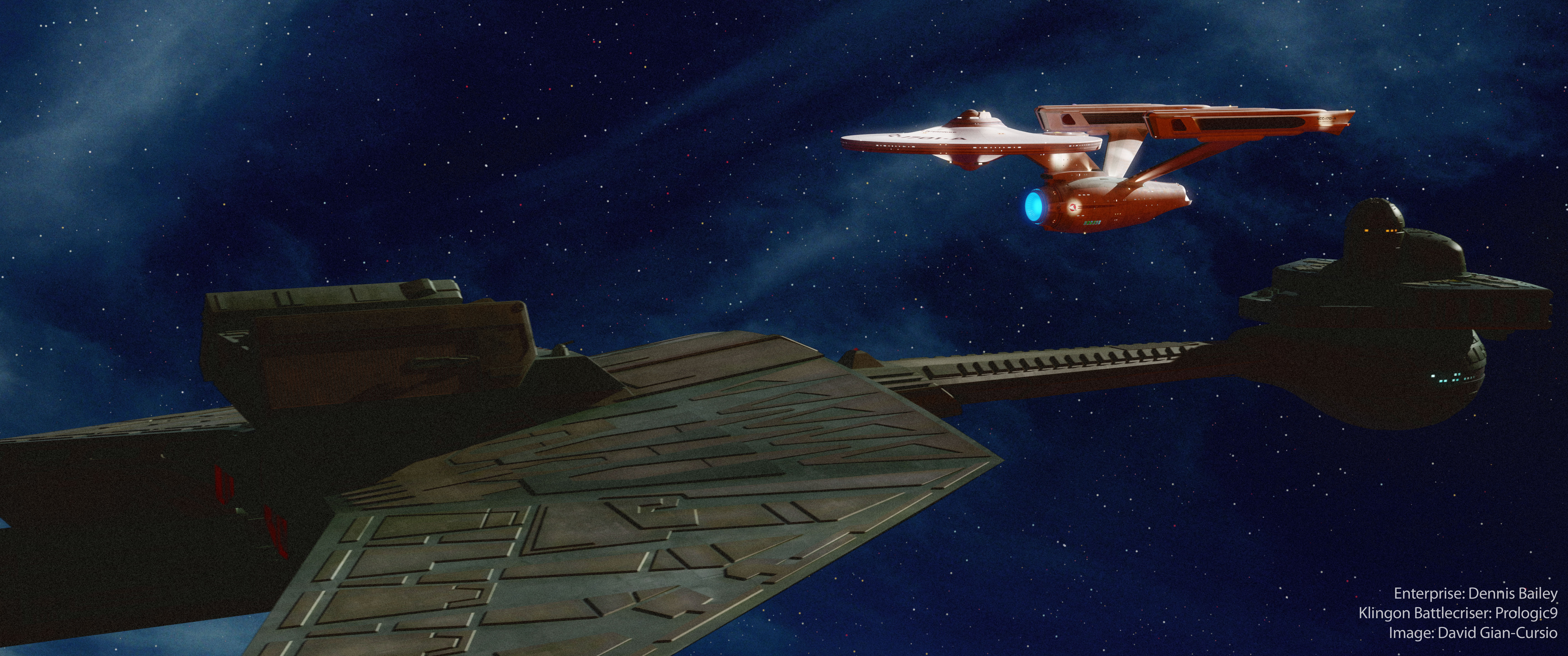
Another picture from clearing out my mental junk drawer. The idea was a Klingon spy photo of the U.S.S. Challenger, a model by Dennis Bailey which combined the design cues from the Enterprise from the 2009 Star Trek movie with the proportions of the original design. In my head, I decided it was a one-off prototype trying out the design features that became mainstream in the timeline of the remake films, but which didn’t catch on in the original Star Trek universe.

I conceived of the shot as an animation, and I may take another whack at that concept, since my original idea is very different from what I ended up with. I changed the setting to the Utopia Planita shipyards at Mars, and populated the scene with ships and drydocks. I intended to mark up the image with Klingon text, my computer isn’t seeing the Klingon fonts for some reason. All in all, I’d say this is a bit of a dud of an image, which isn’t surprising considering the amount of supporting infrastructure I’d have to put into it to get it right (starting with a full Klingon graphics package).

100 Days, 100 Renders— Day 15

CDCR-015-Archer_vs_Klingons_creditsNot every experiment can be a success. I was thinking that I’d have a ’60s-style radiating-sparks effects where the Archer’s phasers hit the Klingon shields, but I drew a blank on how to actually generate it. I also wanted to try adding diffraction spikes to the stars, but that also came up short. On the plus side, I think this is my first finished dramatic image with my Archer model.

100 Days, 100 Renders— Day 14

CDCR-014-Minbari_Arrival_credits

I was a little burned out from yesterday’s fairly elaborate image, so I went for something easy today. There is a little bit of future-proofing involved; the composition is based on a stock shot used in the Babylon 5 episode “Points of Departure.” I didn’t duplicate the animation, but it’ll give me a start whenever I come to that shot in my other project.

100 Days, 100 Renders— Day 12

CDCR-012-Omega_Jump_credits

Another simple shot today. I wanted to experiment with a very wide-angle lens.

I’m finding that stars are tricky in 5K. In reality, stars are so distant they may as well be single points, but they’re also bright enough that if they show up at all in a photograph, they’ll “bloom” outside of a single pixel. I don’t like having well-defined, circular stars (which I do my best to blur), but if I kept them down to a pixel or two in size, they wouldn’t resolve at all on most screens, between conventional resolutions and low dynamic range. Perhaps, on an HDR display, the most accurate-looking stars would be super-bright single pixels (though on such a display, you also wouldn’t need post-processed bloom, since the image would be exactly as bright as it would be in reality, so the viewer’s eye would naturally see bright objects as having glare).

Of course, in reality, you wouldn’t be able to see a single star in a photo like this, though from what I’ve read from astronauts, a few stars actually are visible to the human eye even when looking objects lit by the sun.

Deep thoughts.

100 Days, 100 Renders— Day 11

Eye_to_Eye_Klingon_creditsThis was an older scene that I wasn’t quite happy with on my first attempt. I replaced the Enterprise with my modified version, and altered the lighting. I added in some clouds from an old sky photo give the background some nebular depth. I designed it with the idea of a companion piece from the opposite angle in mind, so the idea is that there’s a blue nebula behind the Enterprise and a red one behind the Klingon ship. It might just make the lighting look incongruous, though.

I also had to run off another pass of stars to get them to show up (I really miss rendering in passes), and did some minor touch-up work in Photoshop in addition to my usual grain-and-bloom to patch over a rendering error on one of the Enterprise’s hull markings.

100 Days, 100 Renders— Day 8

CDCR-007-Early_Narn_Shot

While I was visiting home, I took the opportunity to look through some old copies of Starlog magazine from when I was a kid to find some paintings of the TOS-era Enterprise I remembered. It turned out I was looking for issue 195’s article on David Mattingly’s work, but while I was flipping through, I found one that hadn’t stuck in my mind, before. An article in the September ’92 issue, about a Sci-Fi TV series just entering production called Babylon 5. Judging by the article’s content and what I can figure of the production schedule based on the JMSNews archive, it looks like the article was put together in early summer at the latest; none of the actors are mentioned, some of the characters use their pitch-brochure names or titles (Jakarr, Vice-Commander Takashima), and most of the pictures are illustrations from the pitch document. However, there are three CGI test shots that look to be Foundation Imaging (or, at least, Ron Thornton) originals; a shot of the “Green Ship” transport, a ball-shaped ship that may have been inspired by the moon lander from 2001: A Space Odyssey, and a shot of two space cruisers near a planet. Continue reading

100 Days, 100 Renders— Day 7

CDCR-007-Pike_Over_Mountains

One full week!

I’m not sure there’s anything that’s done as much for sci-fi art as having people living full-time in orbit with a giant window and high-quality digital cameras. The background is from a photo by astronaut Tim Peake. The composition is inspired on an image of the Voyager by Mojo Lebowitz for the Ships of the Line calendar (which also was used as the cover of the novel “Full Circle”).

100 Days, 100 Renders— Day 6

CDCR-006-Pike_at_Orion

As promised, another image from the days of Captain Pike. The background is a photo of the Orion Nebula I was pointed to by a blog post by the Bad Astronomer, Phil Plait.

I experimented with a variation of image-based lighting on this one. The only light source is the plane with the image of the nebula applied to it. I rendered it three times with the Photoshop render buffer export plug-in active, with the nebula set to different degrees of luminosity. I then mixed and matched passes from all three to get the final image to precisely control the look of the ship. The brightest version contributed the diffuse lighting, the medium version gave me the reflection and specularity, and the regular intensity supplied the nebula itself as it appears in the image.

While I was play with my post-processing, I experimented with a more intense, contrasty look than I usually go for, which reminded me of the original 1960s visual effects in Star Trek, and how the occasional astronomical background they used would look after being optically composited.

100 Days, 100 Renders— Day 5

CDCR-005-The_Cage

My original idea for my traveling project was to attack the most recent version of the Babylon 5 hyperspace effect on the plane ride, as seen in 2006’s “The Lost Tales.” It’s an intriguing mix of straightforward (since I can recognize it’s built out of standard Lightwave procedural textures and deformed geometry) and tricky (since there was only one shot of it in the movie, making it hard to deduce more specifics about it).

However, on Wednesday, it was announced that the new Star Trek television series, Discovery, would be taking place roughly a decade prior to the Original Series, during the same time as the adventures of Captain Pike. So instead, I spent my flight redressing Prologic9’s Constitution-class model to resemble the studio models that were used during the filming of Star Trek’s first pilot. My main sources of reference were screencaps from “The Cage,” the Casimiro blueprints, as well as this blog which goes into some detail on the different variations of the original Enterprise design seen over the course of 50 years of Star Trek. That’s where I learned about the blue tint on the ship’s neck which is an interesting variation on the design that I’m trying out. Other differences between the ship’s original version and the more familiar series configuration are a taller bridge, wider deflector dish, a different font for the hull markings, more decals on the top of the saucer, different endcaps on the tails of the nacelles, and gold spikes in the center of the forward nacelle domes. The model was originally unlit, and in the second pilot, while window lighting was added, the nacelle domes remained solid red. I’m assuming that’s why, when the visual effects of the original series were redone for the Blu-Ray release, the pilot version of the model had unlit domes, even though they did light the windows in “The Cage.” I disagree, and split the difference by darkening the domes and reducing their glow and transparency, but still allowing some of the series-style lighting effect through.

100 Days, 100 Renders— Day 2

CDCR-002a_Terror_off

I had the idea for this image a while ago, not long after I finished my Puddle Jumper model. As I recall, I got the idea looking at the cover of The Terror, a historical novel by Dan Simmons describing the horrible fate of the Franklin Expedition as the crew succumbs to the harsh environment and also some sort of bear-monster. I think that part was a metaphor for how we’ll never know entirely what happened to those people.

Anyway, I more-or-less saw it in my minds eye as you see it above. Crashed Puddle Jumper buried in the snow, askew Stargate in the background, a set of lonely, filled tracks marching back. My premise for the image is that the ship tried flying through an older gate, unaware that it had fallen prey to the elements in the years since it was last used. The Jumper emerged at an odd angle, the left wing clipped the ground and sheared off as it was extending, and the rest of it plowed into the snow a short distance away. Continue reading