Random Trek #86- “Time’s Arrow, Parts 1 & 2”

Random Trek 86: “Time’s Arrow Part 1 and 2” (TNG) with David Gian-Cursio

Random Trek 86: “Time’s Arrow Part 1 and 2” (TNG) with David Gian-Cursio

Back around Thanksgiving of 2015, I was listening to an episode of the podcast Random Trek, when the host, Scott McNulty, mentioned being a fan of the Ships of the Line art calendars. I tweeted him, mentioning that I’d be in the 2016 edition, and he invited me to appear on the show to coincide with my picture coming up.

The premise of Random Trek, simply put, is that Scott discusses a random episode of Star Trek with a non-random guest. As luck would have it, the random number generator gave us the episode “Time’s Arrow,” the two-part season-finalé/première of The Next Generation’s fifth and sixth seasons. As is Random Trek’s custom, this meant we recorded a double-length episode discussing both parts. And it’s a good thing, too, because we blew past a single episode’s runtime just discussing myself, the calendar, and nerding out on Star Trek in general. And I probably could’ve kept going, but I knew people came to hear about Data meeting Mark Twain, and not my many, many opinions on Star Trek.

To Random Trek listeners who are visiting for the first time, welcome! In the spirt of restraint and being a well-mannered guest, I didn’t pimp myself out too much on the air, but you’re on my website, now! Aside from the Ships of the Line 2016 calendar, some of my other notable works include my on-hiatus project to remake the visual effects of an episode of Babylon 5 (I’ll get back to it eventually), cutscenes for the fan-made Battlestar Galactica flight sim Diaspora, and contributions to various projects with Ninjaneer Studios, including a Ming treasure-ship for the opera The Red Silk Thread and a ruined city for the exhibit Corrosion: The Silent Menace at the Orlando Science Center (featuring TNG alum LeVar Burton).

If you’d like to keep up with me, my Twitter handle is @davidcgc, and I can often be found hanging around Foundation3D, the A.V. Club, and the TrekBBS.

In the spirit of providing added value, here are some notes and links related to things I mentioned on the show.

SotL_Feb_2016_Comparing_Notes_Amazon_Preview

“Comparing Notes,” as it appears in the calendar. Image courtesy of Amazon.com

Continue reading

Archer-class Starship

Comparison of my model with Masao Okazaki’s original schematic drawing

Download Lightwave 2015 Version

Download FBX/OBJ Version

The Archer-class starship is a small TOS-era scout designed by Masao Okazaki for the Star Trek: Vanguard novels created by David Mack, Dayton Ward & Kevin Dilmore, and Marco Palmieri. I began the model some time ago, after getting the idea of doing an opening credits sequence animation for the then-recently-announced Star Trek: Seekers spin-off series.

Continue reading

Warp Point Nine

After reading “Return to Tomorrow,” including a description of how the jump-to-warp effect was achieved in TMP (multiple long exposures, with the main trail coming from shooting a long exposure with blue fill lighting), I decided that I’d have to give it a shot myself, sooner or later.

Not long after, I tracked down an old render of the Enterprise-E I quite liked, “Apocalyptic Amenity,” since I kept being reminded it of it by the title of the Trek novel “Armageddon’s Arrow.” I even had it as my phone wallpaper for a while, and then felt awkward that I didn’t have any work of my own I could use on a phone, since I never do anything in portrait. I decided that I’d have to give it a shot myself, sooner or later.

So I set up a scene a week or so back. I looked up some iOS wallpaper templates (because it’s not just the screen, there’s also a margin for the parallax effect), and decided to render out a large square version that I could crop down for an iPhone, or leave as-is for an iPad, or crop to who knows what. I aligned it to leave a gap for the date and time, and so the lines of perspective would make a nice dynamic composition. Unfortunately, I didn’t know the Big iPad would become a real thing today, so it’s not quite large enough for that.

I did some test renders, and found I couldn’t get a long-exposure effect in a single render (at least, not by setting the motion blur distance to greater that 100%, attempting to have it encompass multiple frames of action). What I ended up doing was setting up an animation, setting the motion blur distance to 100% so each frame would touch to the next, and then rendering an image sequence for the length of the streak I wanted. After that, I brought them all into Photoshop as layers in a single document with additive blending, creating nice, smooth light trails.

The way I did the rainbow streaks was excessively painstaking. I took out the final warp-jump in the film, and set it as my background in Lightwave Layout. I modeled a single streak, and then painstaking rotated every one into place to match the pattern of the original after lining up my camera to the original shot. I don’t know if the streaks were in the same pattern for the other three warp shots in the film, and I don’t care. I’ll be happier not checking.

TMP Warp iPad

TMP Warp iPhone 5

Refit-Enterprise by Dennis Bailey

Enterprise-Refit Interiors

Last year, around the time the 5K iMac and 2016 Ships of the Line calendar contest were announced, I got the idea of making window boxes for Dennis Bailey’s refit-Enterprise model so as to show more detail in the high-resolution images of the future. This has been my favorite science fiction design for as long as I can remember, so simple textured boxes were right out. I wanted to have furniture, even crew people visible through the windows. It took a while but, the results were worth it.

The layout of the rooms is based more-or-less on the Strategic Designs blueprint set, with some details from Mr. Scott’s Guide to the Enterprise and my own interpretations.

The model includes three swappable objects, based on locations that changed between the original Enterprise and the A. The officer’s lounge under the bridge can be replaced with a dining room, the large shuttlebay from TMP can be swapped for the enclosed version from TFF, and the swirling, gaseous warp core from the early movies can exchanged for the pulsing TNG model. The idea is that I could easily mix-and-match to represent other Constitution-class ships of varying configurations. I’m a big fan of the idea that sister-ships shouldn’t be perfectly identical except for the name painted on the front.

The whole configuration also comes in two versions, one in smooth earth-tones as the original Enterprise appeared in the first three movies, and one with more greeblies and silver and blue-gray coloring as the Enterprise-A appeared in The Undiscovered Country.

The crew people are very low-detail, little more than stick figures, but come in male and female, and have various skin tones and hair colors. I also set them up so it was simple to change the style of their uniforms, from the movie-era all the way to the various TNG-era uniforms.

The only drawback is that the lighting for the windows is a little dim compared to the official model, but I’ve been rendering in passes for years anyway, so it isn’t any trouble to brighten up the windows after the fact.

I included some small shots from inside the rooms but, to be clear, this is an exterior-only model. It’s no secret that interiors and exteriors for buildings and vehicles in film rarely match up perfectly, and these are no exception, with compromises made for the Recreation Deck, the Cargo Bay, and the height of all the rooms along the saucer’s edge, especially. Anyone building a model of the interiors of the movie-era Enterprise would have to ignore the outer shape of the ship to get those to look correct. The shuttlebay observation galleries being a half-deck below the window line on the exterior ship could be argued to be a feature of the “real” ship, but I’m not sure I like it.

After I finished the interior, I decided to gussy up the texturing on the main model, as well. I’ve been fiddling with the textures and lighting setup since I first downloaded it, but this time I set out to match the reflective, pearlescent paint job the studio model had for the first Star Trek movie. It ended up being surprisingly straightforward to get multi-colored highlights out of the model’s original textures, and adding reflectivity to the surfaces also required only a little trial-and-error to nail down.

I’ve rendered off shots from three angles so you compare Dennis’s original model to all the stuff I’ve done to it.

My version is on the left, the original on the right.


Ent_Front_Mod_Blue

And here are some full-sized versions of my revamp for you.

You can see more work-in-progress images and read more details about the creation of model in this thread at Foundation3D. The model itself, along with an FBX conversion, and just the crew figures, is also available for download there. You’ll have to modify Dennis’s model to use them, which is why they’re in the “unfinished” section of F3D, but the Read Me explains what you need to look for.

You can also download them here:

Interiors (LWO)

Interiors (FBX)

Crew (LWO & FBX)

Comparing Notes

“Comparing Notes” was one of three favorite Trek images I submitted for consideration in the 2016 Ships of the Line Calendar contest (The others were “Charting the Crucible” and “Quiet Night at the Office,” if you’re curious). This one was a winner! I’d hoped to have a chance to gussy up the render for the calendar, but I ended up only having time to make a couple small tweaks when I re-rendered it at print resolution. I adjusted the lighting so the blue and yellow banding in the shadows that I mention was less apparent, corrected a minor lighting problem on the Enterprise’s neck that made a harsh shadow, and added some very subtle window boxes to the Endeavour. I didn’t finish the window boxes for the Enterprisethough I have been working on them in the meantime. I also opened up the frame vertically since the aspect ratio of the calendar is taller than I usually make my pictures.

Original Post:

Comparing Notes

Having some time to return to Lightwave and a truly spiffy model of the TMP drydock, I decided to address an image bunny which had been itching me for a while. Namely, I’d wanted to do a take on this Andrew Probert painting with the Enterprise reflected pre- and post-refit. I ultimately remembered a photo from 1912 of the Titanic and her sister ship Olympic side-by-side at the repair yard and decided to do something similar.

In this case, the newly-upgraded Enterprise has returned to Earth so the engineers of the U.S.S. Endeavour can get some practical experience with the new designs as they begin to refit their own ship.

I colored the main light as if the sun had just set at that moment. It gives the picture a bit of a sepia tone. It also explains why the image is so grainy, because the photo had to be taken at a very high ISO since there was no more direct sunlight. I pulled the colors from this photo. In retrospect, I botched the lighting a little, as you can see banded shadows because I used two lights, one blue to represent the upper sky, and one red to represent the sky at the horizon. I am, however, very happy with the coherence (for want of a better term) of the image. A lot of times, the different eras of Star Trek can end up looking like totally different universes, and I feel like I avoided that in this one. There doesn’t seem anything at all odd about the original series and movie era sitting side-by-side.

I’m actually thinking I might be able to get a little more milage out of this picture. I may try out some alternate lighting setups.

Comparing_Notes_Midnight

Quiet Night at the Office

I got another bite of the render bug the other day. I’m going to need that to start coming a bit more consistently again.

I originally visualized this angle with a Miranda-class ship, but I don’t have a modern Miranda that’ll hold up to this kind of proximity and detail. While I was assembling the scene, I found I’d already had one from an earlier attempt to make a nighttime drydock render, but I hadn’t been able to settle on a good angle. So I loaded in the old scene, aligned it to fit the picture in my head, added a bunch more spotlights, and rendered it.

I think this works much better as a night shot than my prior attempts have. My initial inspiration for the shot, lighting and mood-wise, was this photo of a cruise ship docked at night:

The background is from NASA’s library of astronaut photos of Earth. It’s actually a shot of the terminator. I desaturated it and then recolored it dark blue to represent a barely-visible nightside. Also, since I figured a night shot would require a longer exposure, I cranked up the motion blur well past 100%, so the various shuttlecraft that are buzzing around are barely-defined blurs.

Updated 2015-09-03:

Quiet Night at the Office 5K

I’ve re-rendered “Quiet Night” in 5K. There are a couple of deliberate changes in this one compared to the original version of “Quiet Night at the Office.” The most obvious is probably that I repositioned all the travel pods and work bees because I set up the scene to animate and wanted more visually interesting flight-paths. I dialed back the motion blur a bit, as well.

A little more subtle touch is that I changed the ship from the Enterprise to the Endeavour, after a tedious evening of aligning and stenciling text. I wonder if there’s a script or something that you could write to do that.

I brightened up the windows considerably on this image, possibly too much. It’s more like my original aim for them, where they still look a lot like the featureless white of the studio model, but have just the subtlest suggestion of depth. You can just barely see a person in the first long window to the left of the gangway. I also think I might’ve been a bit too heavy on the grain, but I’d like to see it on a retina/hiDPI/5K screen before I make a final judgement.

Updated 2016-02-14:

And here’s an animated version.

Just a quick refit-Enterprise beauty shot

(I just realized writing the topic, I really can’t call this ship “the movie Enterprise” anymore)


I suddenly felt the spirt move me today waiting for class to begin, and fired up Lightwave for a quick pic. I couldn’t have spent more than ten minutes setting up the camera and the key light (and most of that was fine-tuning the light to get a spec hit I liked). Since it was just me doing a quick little thing, I didn’t do a proper multi-file breakdown, but instead manually turned on and off each set of lights and glows to render out six layers (ambient occlusion, key diffusion, key spec, model glows, the model’s self-light rig, and the model’s lighting-rig’s lens flares), all saved as HDR .exr files.

I felt like trying something new, so rather than using my trusty old BetterSpace star field (first thing I ever made in Lightwave!) I gave Greg Martin’s photoshop star field a shot. It’s definitely different. More painterly than usual. Also, while I was looking it up, I saw Greg Martin’s doing a cool eight-planets multi-artist astronomical art thing that I thought was pretty inspiring.

Anywho, I adjusted and bloomed the heck out of all my passes, slapped in some film grain, and called it done. Well, there was a little more fine-tuning and experimentation involved than that makes it sound like, but it’s really more fun to do than it is to talk about.

Stardate 1277.1— All is Well

Ship’s Log, U.S.S. Kelvin, Stardate 1277.1. Captain Richard Robau recording.

We are on course to deliver our cargo of colonists and supplies to Beta Antares IV. The journey remains uneventful, and all is well. On a personal note, it gives me great pride to record in this log the first birth on board the Kelvin. James Tiberius Kirk was born this morning to Lieutenant Commander George and Lieutenant J.G. Winona Kirk. James is named for his grandfathers, and is the Kirks’ second son. On behalf of the entire crew, I’d like to note our congratulations and good wishes on this happy occasion.

So, here’s how it happened in the Prime Universe (“Harold,” to its friends). No Red Matter singularity, no diversion to the star to investigate, no mystery attack, just another day in space. My own little (very little) twist on the opening sequence of the new Star Trek. I pretty much had to do it as soon as I saw that a Lightwave version of Tobias Richter’s Kelvin was available, since I felt that it totally stole the show.

Charting the Crucible

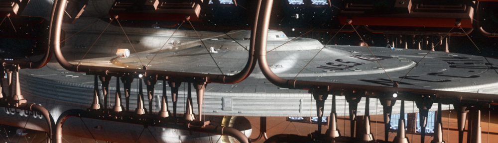
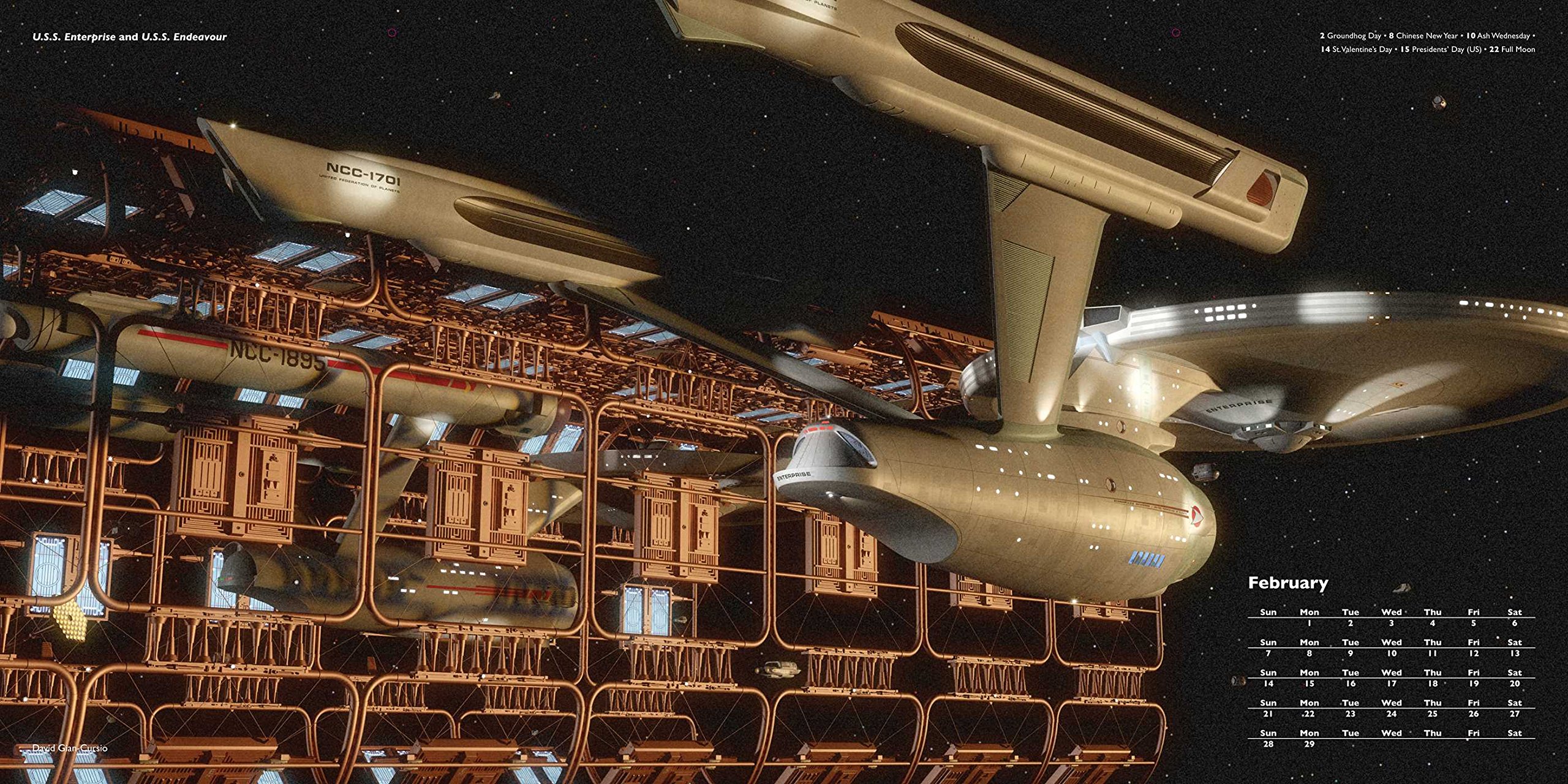
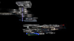
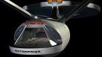
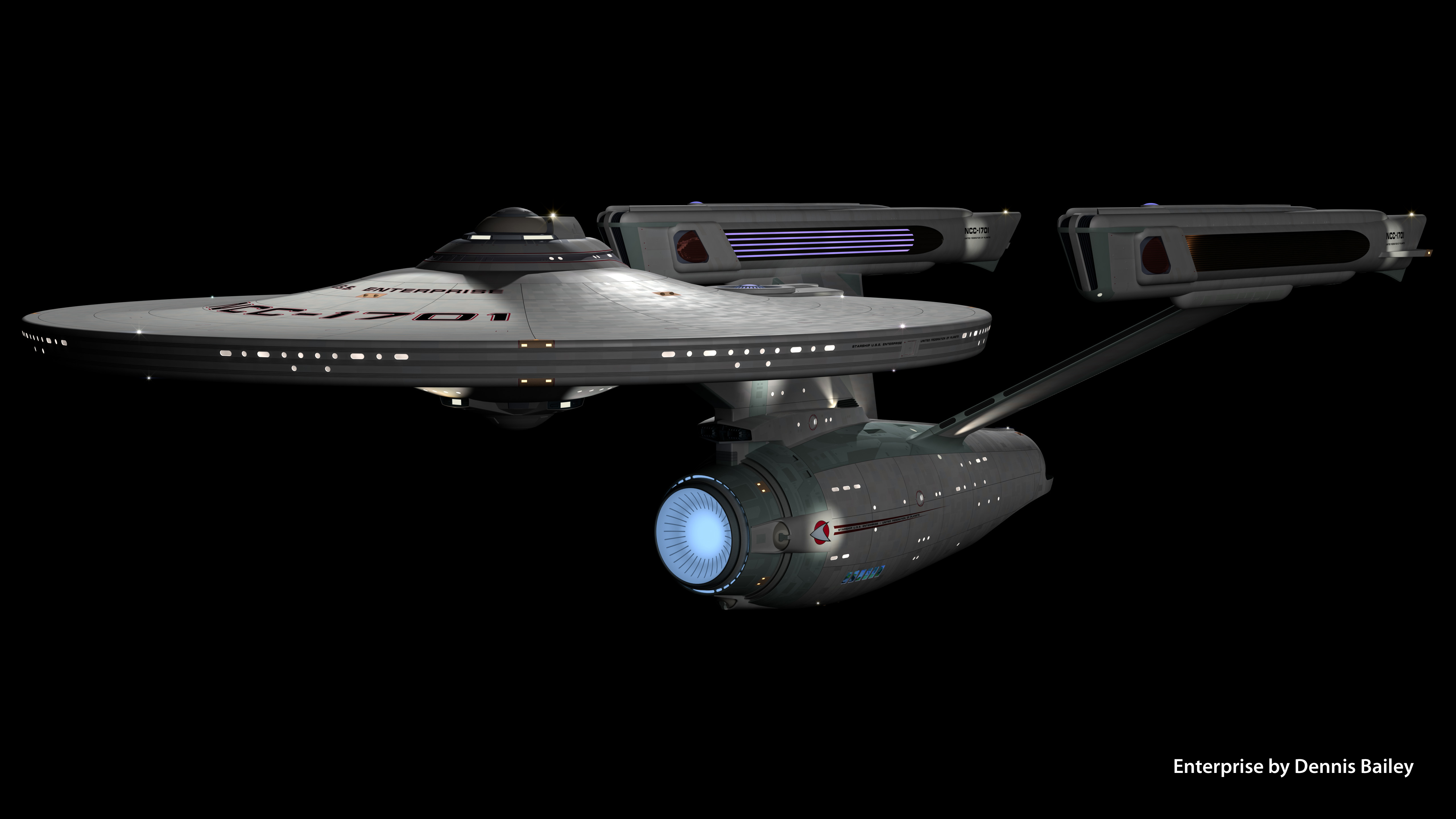
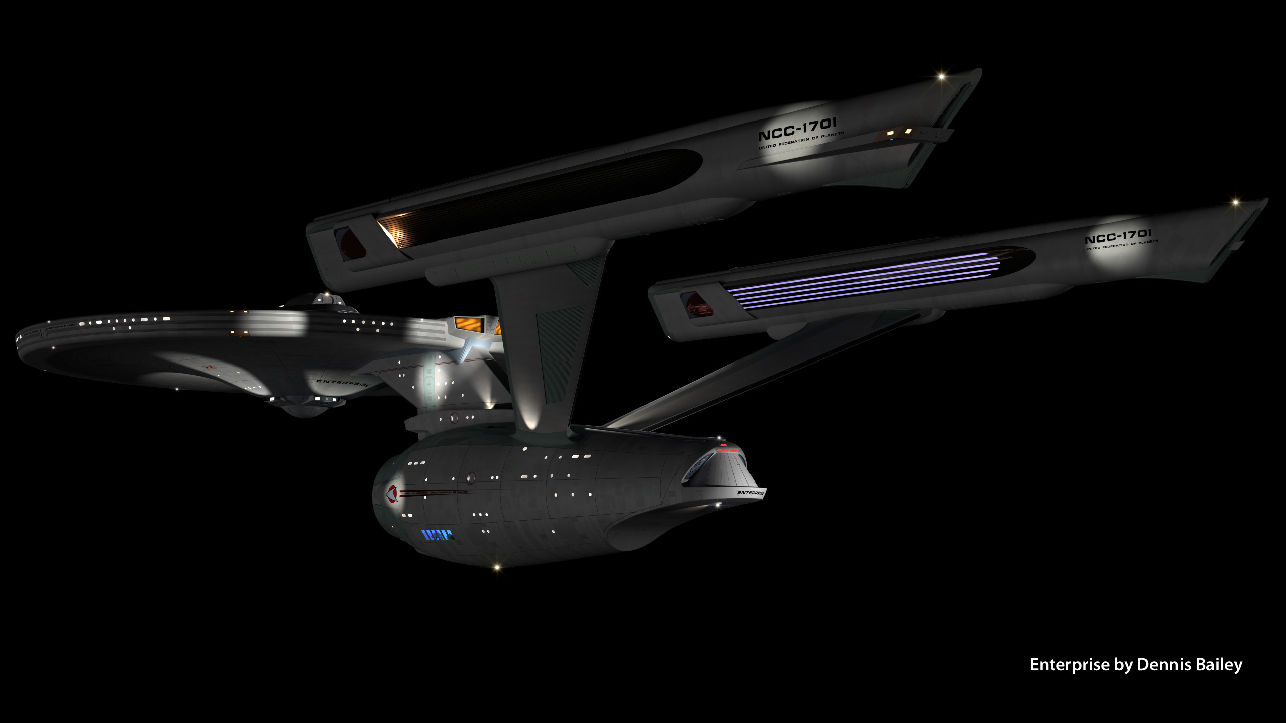
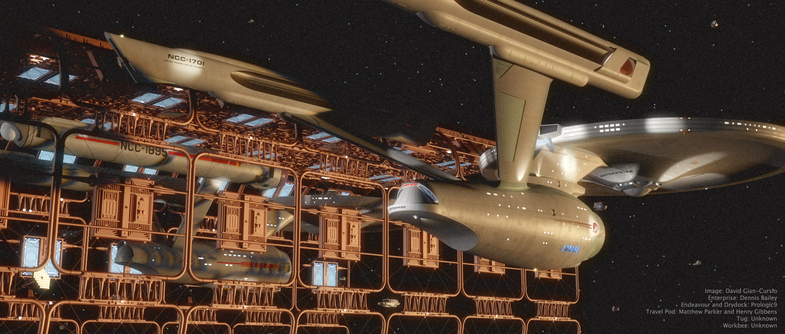
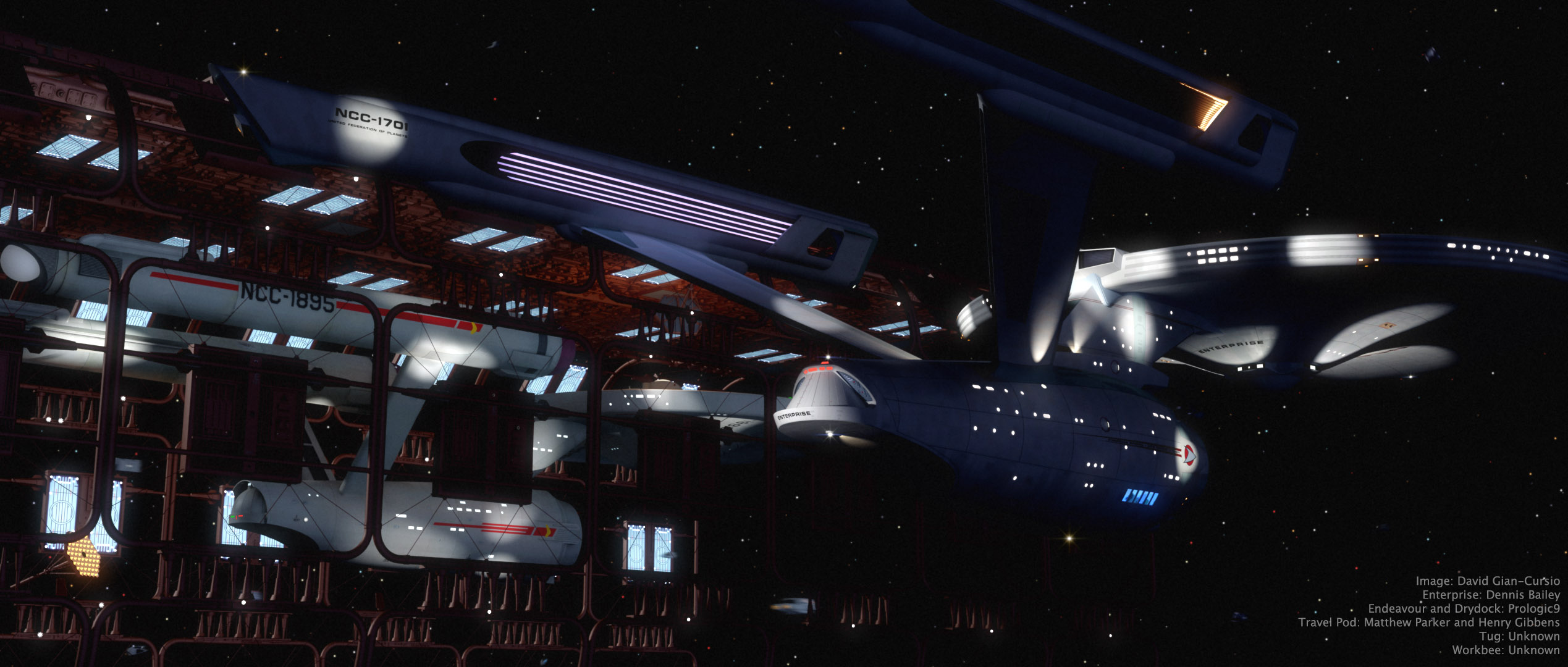
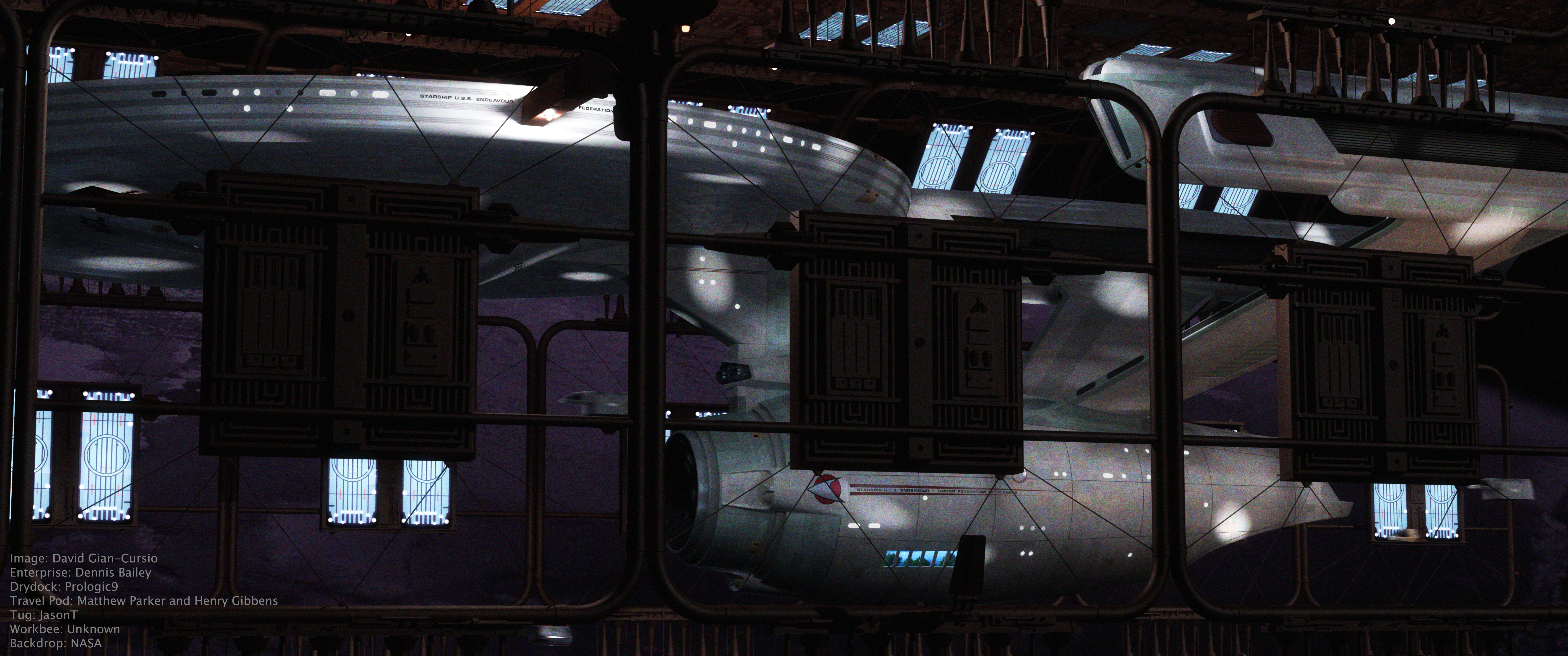
This picture was inspired by a shot in early season 3 of Battlestar Galactica, where Galactica emerges from behind a cloud in a nebula, looking for all the world like a seaship emerging from a fogbank. I decided some time ago that the movie-era Enterprise would be a perfect ship for my own take on the shot, given that it’s my favorite spaceship and that it’s long, sleek profile means it’d fit well in the aspect ratio I normally use.

The nebula background (and foreground) was a composite of four photos of clouds I’ve taken over the years (and anyone who’s ever seen me while I’m holding a camera can tell you that I photograph a lot of clouds), colored, mixed, and generally fussed with in Photoshop. I did a good deal of fiddling with the bloom and fog depth effects on the ship as well, until I was happy with them. I quite like the colors in this picture, and it’s one of my new favorites. And any day I can look at a picture and think “new favorite” is a good day.

As for the narrative of the image, all I can say is, it’s not from The Wrath of Khan. It’s a nice, peaceful image of the starship Enterprise exploring another, completely unrelated nebula. I know it looks like the nebula from The Wrath of Khan but, well, it’s not. Because I said so.


Added July 11, 2008

In light of the interest this picture has gotten, I’m putting up a quarter-sized version of the final Photoshop file, as well as the source files I used to create it, for others to examine for self-educational purposes.

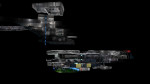
On the nebula effects:
The first thing I did was put in the foreground cloud. I cut it out using a layer mask that I made from selecting the color of the sky, because there was a pretty clean division and I’m far, far too lazy to matte by hand when I don’t absolutely have to. I used an adjustment layer to give it it’s color, and then another photo of a sunset to break up its color a little. I used the same layer mask to block out these two layers, as well as the bloom layer for the ship.

For the bottom layer of the background nebula, I started with a light, whispy photo of clouds, with the opacity turned down a smidge so the black background layer would darken it up a little. Then came an adjustment layer the same color as the one for the foreground cloud, with this one set to “Linear Burn” in the blending mode to darken it up, and the “Blend if” box in the blending options being set to reduce the blending as the underlying layer got brighter. This set off the clouds in that picture more from the sky. I used the same sunset again to alter the color of this part of the clouds in the next layer up, this one set to “Vivid Light.” The topmost layer was another sunset photo, with smooth bands of red clouds, that I placed in the upper right to help justify the red light on the top of the ship. That one was matted in with a layer mask as well, with much tweaking of its levels so the red part would show up but not the sky behind it.

After I’d done all this, I still didn’t feel like it was quite done. Eventually, I realized what was missing and ran back to Lightwave to render out a depth pass of the ship using the Render Buffer Export. I used that as a layer mask on the ship layer, which helped sell that it was traveling through a gaseous medium (it’s most apparent where you can see the foreground warp engine overlap the background one, but it affected the whole ship.) The topmost layer was a merged version of the image, with a filmgrain-and-blur applied, and then darkened substantially with levels, and set to about 50% opacity.

—–

It took some doing to matte in the cloud without getting a black edge of what used to be sky. Even once I’d pulled that out, I found that the thick, full feel of the cloud completely broke with the thin, wispy clouds I used in the background. I didn’t really have a more suitable cloud, and didn’t want to render a 3D one for time and aesthetic reasons, and the composition didn’t work if I took it out all together, so I made it fit more with the background by giving it some of the same color variation. It still wasn’t perfect, but it served its purpose of framing the ship.

———-

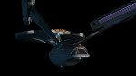
On the appearance of the ship:
I think that feeling of solidity came out in Photoshop. The lighting was pretty basic, all told. The model’s rig, along with a small white area light at about ten o’clock for the rim light, a large red area light high and past the model, and a bluish area light behind and below the camera. (I also rendered the image with “Final Gather” radiosity enabled.)

Turning layers on and off, it seems that the CGI went away with the top layer, which was duplicate of the merged image, with film grain applied and the levels adjusted so the whole ship was almost entirely black, and then reduced it to 50% opacity.

Saturn, Saturn, and More Saturn!

I recently realized that I’d been putting off making a scene of Saturn, even though I knew what I had to do to make it work. Seizing the opportunity to do some work in Layout again, I made a scale reproduction of Saturn, it’s rings, and five or six moons (the ones I found good maps for). I’ve already made similar set-ups for Jupiter and Earth. While I was working on it, I came up with ideas for three pictures using it, so here they are.

“Gossamer” is just a beauty shot of the planet.


“Take Us Out” is a Star Trek picture that’s something of a riff on the end of the computer game “Starfleet Academy,” where the Enterprise-A is seen in drydock around Saturn.


“Ouroboros” is a Stargate SG-1 picture, based off the first season cliffhanger. I felt like the the picture needed a quote, but I couldn’t think of anything specific, so I searched Google for quotes relating to the word “serpent” until I found something that was apropos to the situation.